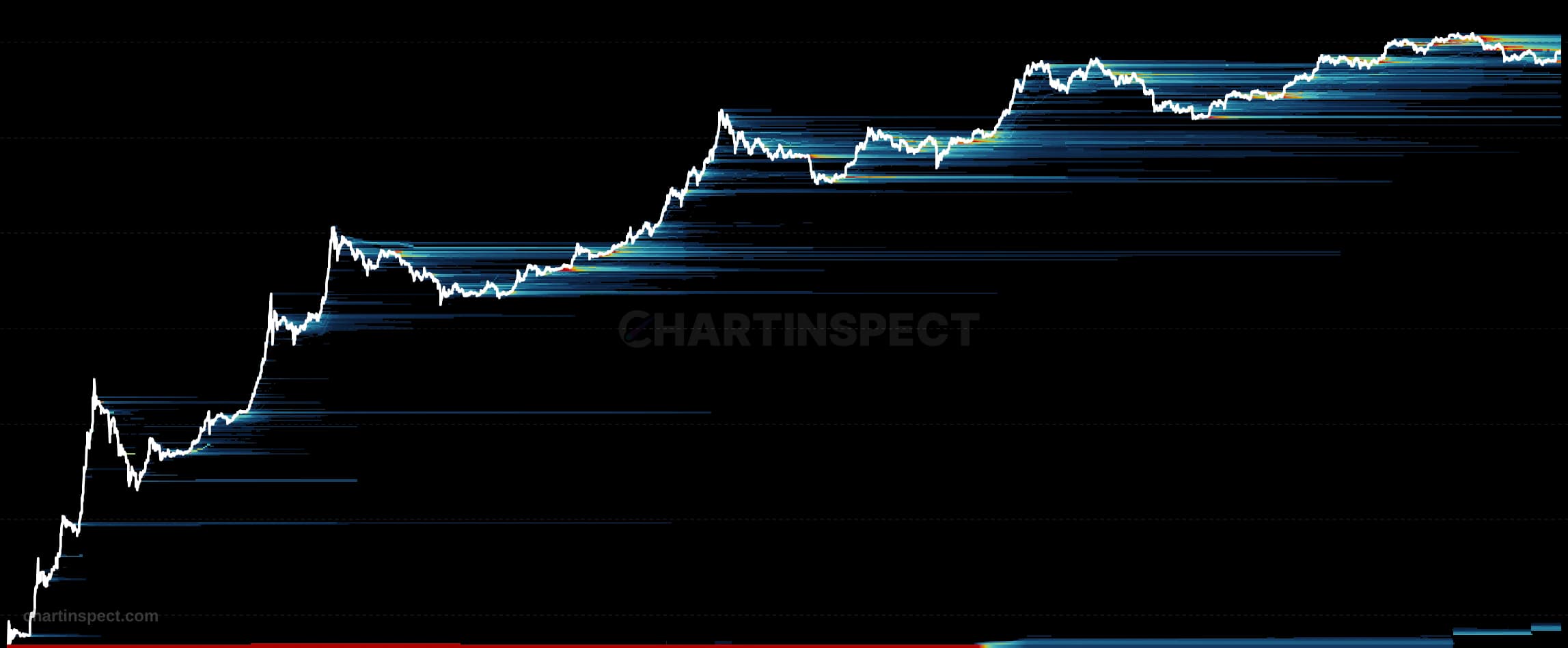
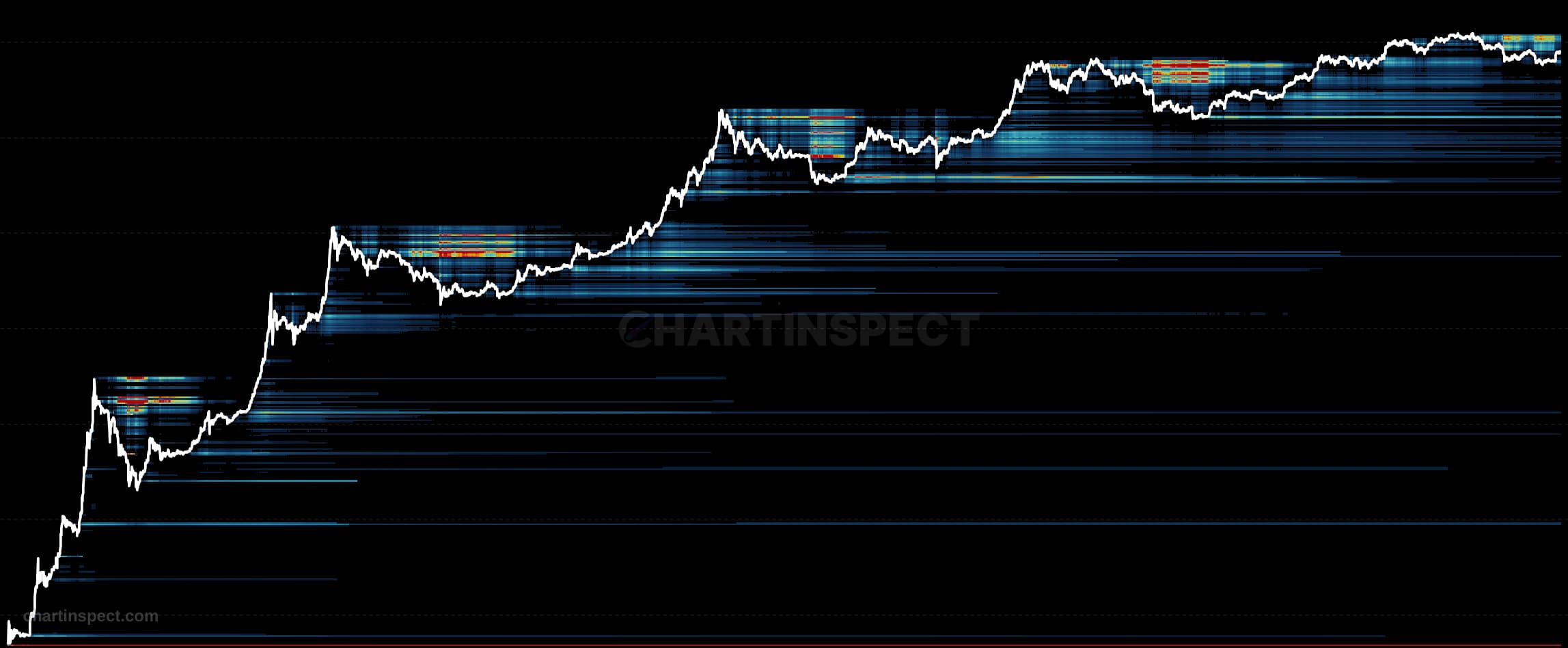
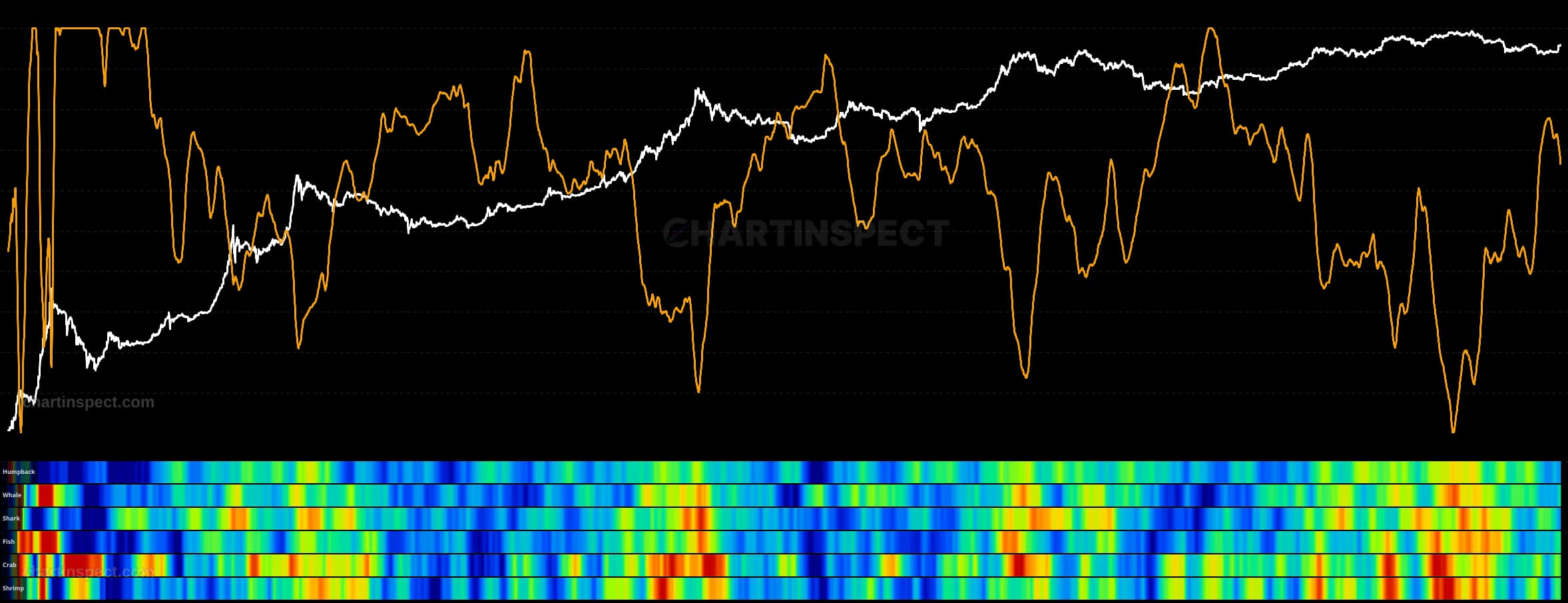
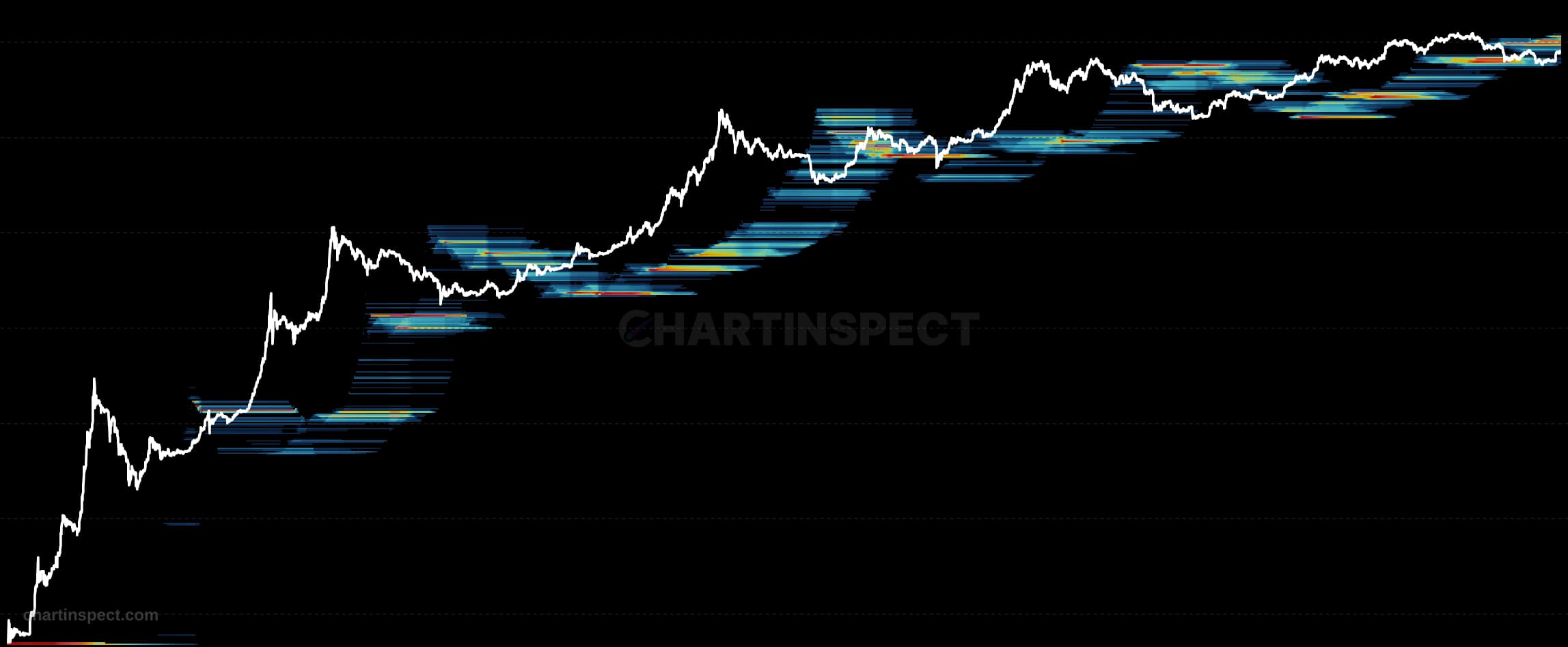
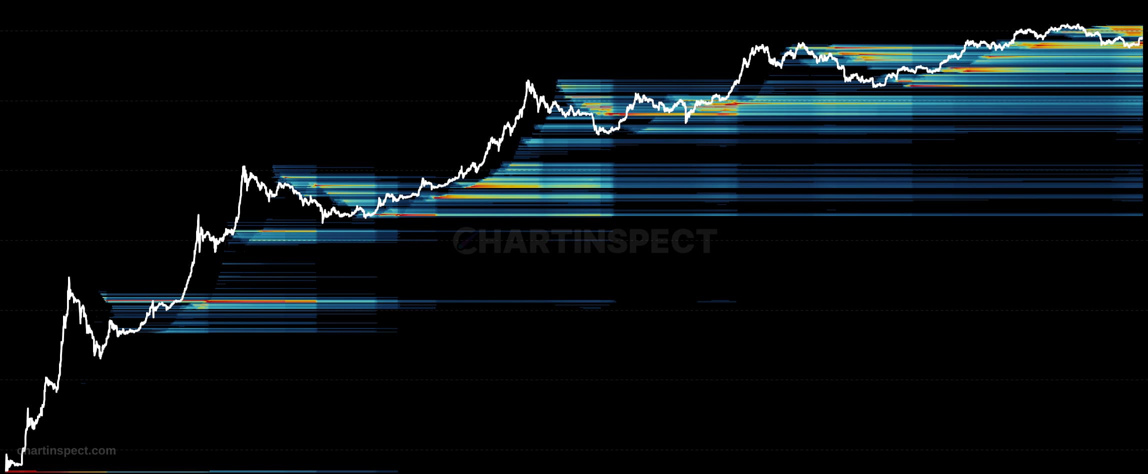
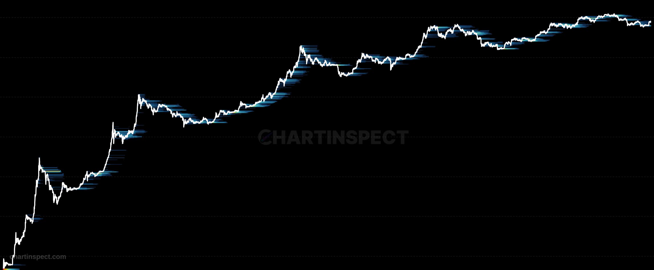
The Bitcoin Address Count Heatmap maps the number of unique addresses holding coins at each cost basis price level over time. Rather than measuring how much supply sits at a given acquisition price, it counts how many distinct addresses acquired their Bitcoin near that level, adding a holder-count dimension to the standard supply-based cost basis heatmap. Each cell represents a price band on the vertical axis and a point in time on the horizontal axis, colored by the concentration of addresses whose cost basis falls within it.
Read the brightest bands as the price levels where the largest number of addresses established their positions. A level lit by millions of addresses represents broad retail participation and strong support that is difficult to break, since dislodging it would require convincing a very large, dispersed holder base to sell. The same quantity of supply concentrated in only a handful of addresses shows up as a sparse band, signaling whale-dominated and comparatively fragile support that can give way quickly if those few holders move.
Use this chart alongside the supply-based cost basis heatmap to distinguish the character of support and resistance in Bitcoin. Where both heatmaps agree that a level is heavy, retail conviction reinforces the capital committed there. Where supply is large but the address count is thin, the level rests on a few whales, and its durability depends on their behavior rather than on broad market participation.
Check the selected asset, units, and cohort before comparing readings. Compare the metric over consistent dates and use related measures to understand what contributes to a change.