On-Chain Metrics
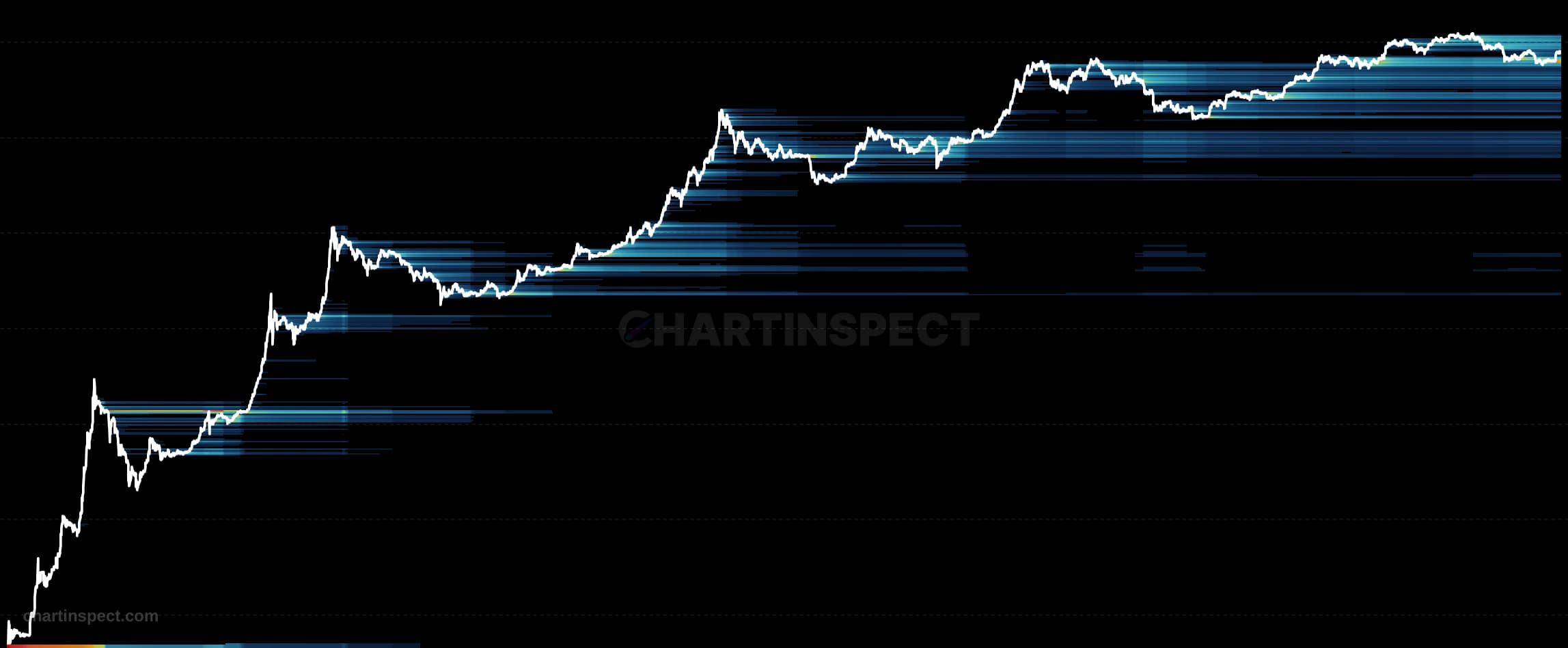
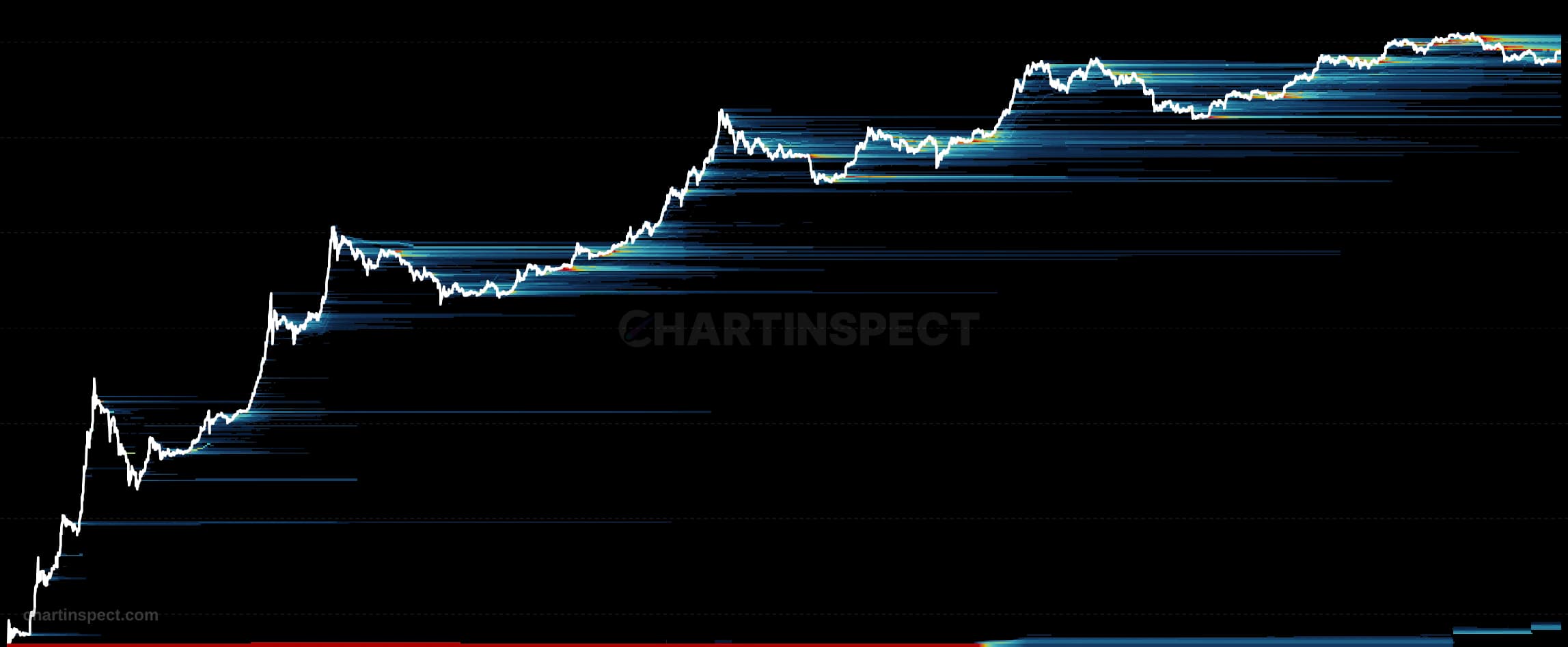
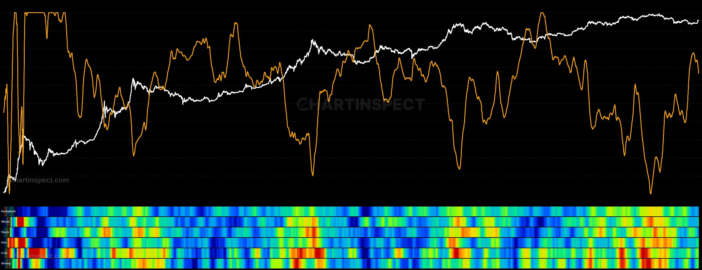
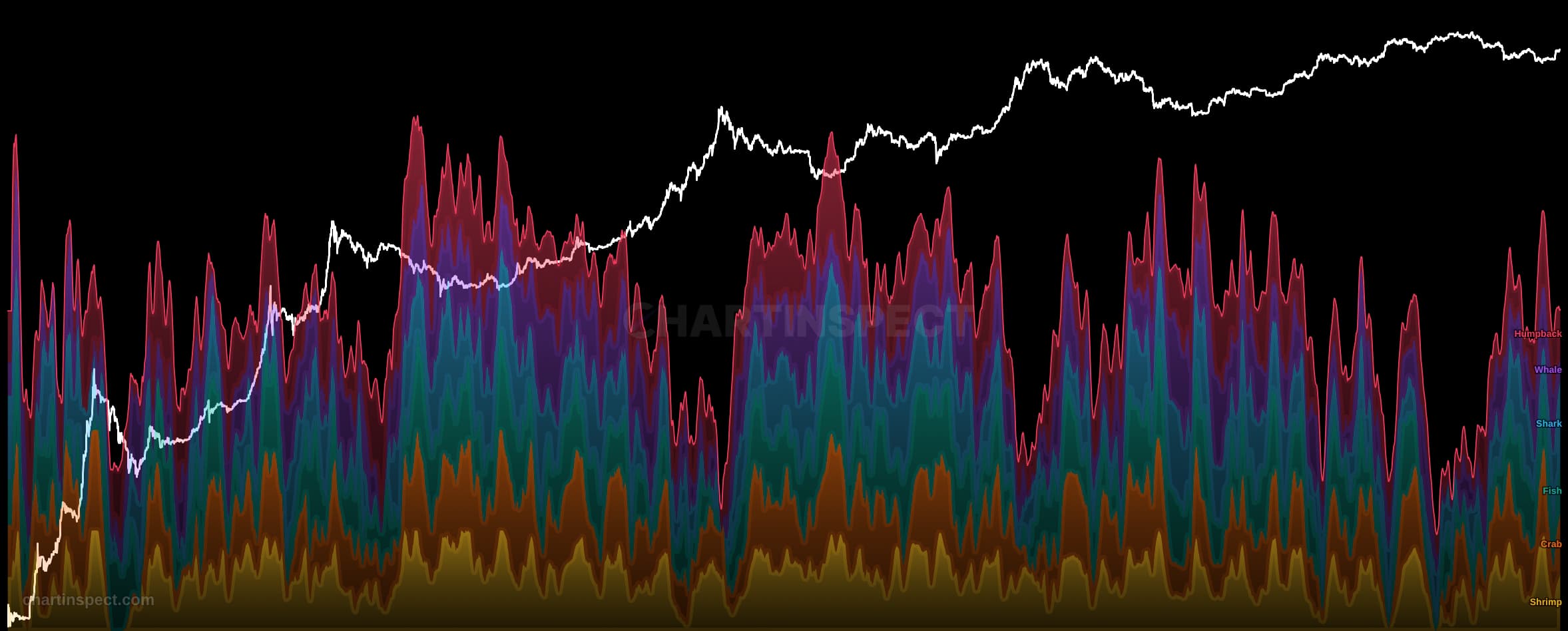
Visualizes the dollar value of unrealized profit and loss concentrated at each cost basis price level over time. Bright cells below the current price represent large unrealized profits from holders who bought cheap, while bright cells above price show trapped holders sitting on significant unrealized losses. Includes profit/loss ratio overlay, profit take rate, and loss realization rate indicators. Supports USD and native coin denomination.
The Bitcoin Unrealized P/L Heatmap visualizes the dollar value of unrealized profit and loss concentrated at each cost basis price level over time. For every price band, the heatmap measures how much of the Bitcoin supply last moved there and what that supply is worth today relative to the current price, then renders that magnitude as cell brightness. It supports both USD and native coin denomination, so you can read the concentration in dollar terms or in Bitcoin.
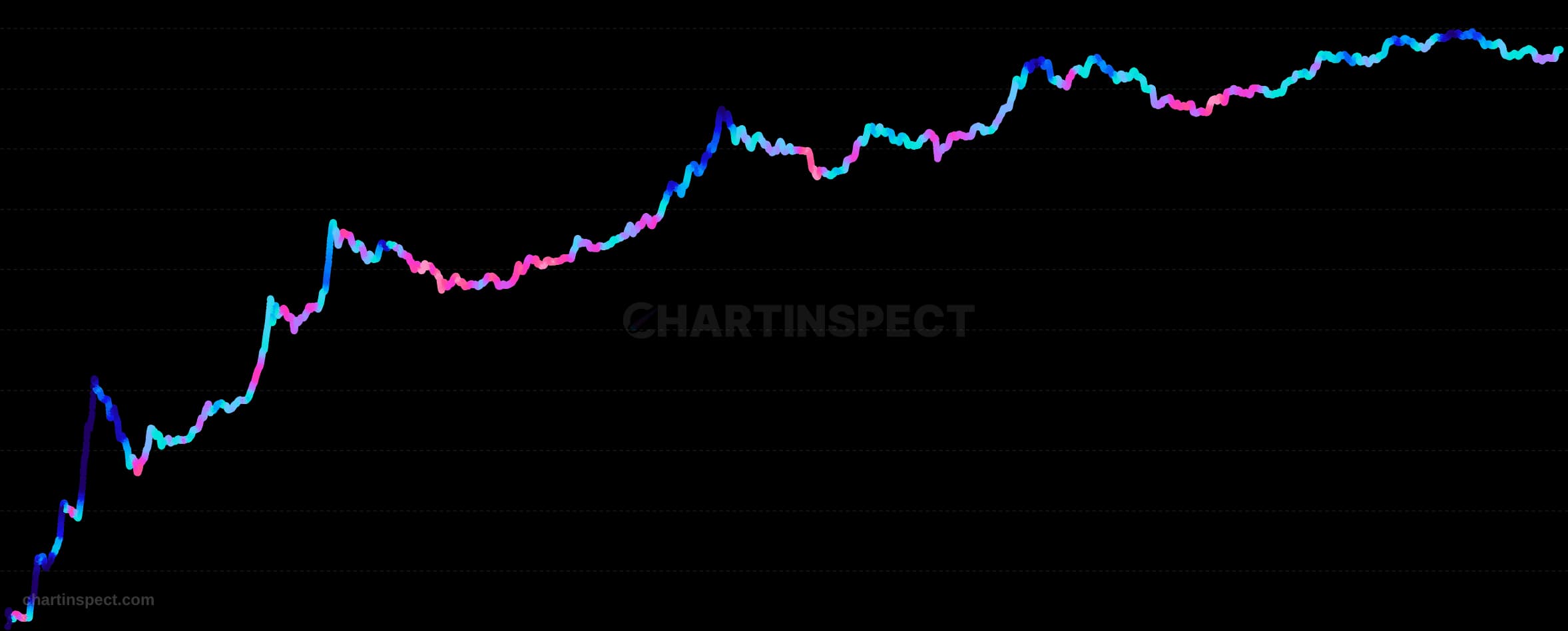
Bright cells below the current price mark large unrealized profits held by investors who bought cheap, while bright cells above price reveal trapped holders sitting on significant unrealized losses. Reading the map vertically shows where cost basis is clustered; reading it horizontally shows how those clusters migrate as price moves through them. The chart also carries a profit/loss ratio overlay alongside profit take rate and loss realization rate indicators, which track how aggressively holders in profit are selling versus how quickly underwater holders are capitulating.
Use the heatmap to locate supply-based support and resistance in Bitcoin. Dense profit bands below price often act as a floor of conviction, while heavy loss bands above price mark levels where trapped holders are likely to sell into strength. Rising profit take and loss realization rates signal that these cost-basis clusters are actively unwinding.
Check the selected asset, units, and cohort before comparing readings. Compare the metric over consistent dates and use related measures to understand what contributes to a change.
Addresses and on-chain cohorts do not identify individual people. Network designs and available histories differ, so a threshold observed on one asset may not transfer to another.
Visualizes the dollar value of unrealized profit and loss concentrated at each cost basis price level over time. Bright cells below the current price represent large unrealized profits from holders who bought cheap, while bright cells above price show trapped holders sitting on significant unrealized losses. Includes profit/loss ratio overlay, profit take rate, and loss realization rate indicators. Supports USD and native coin denomination.
Freshness: Not yet verified
No community calls on Unrealized P/L Heatmap yet. Be the first to share a take.
Discover more insights with our comprehensive chart collection
Explore All 8012 Charts