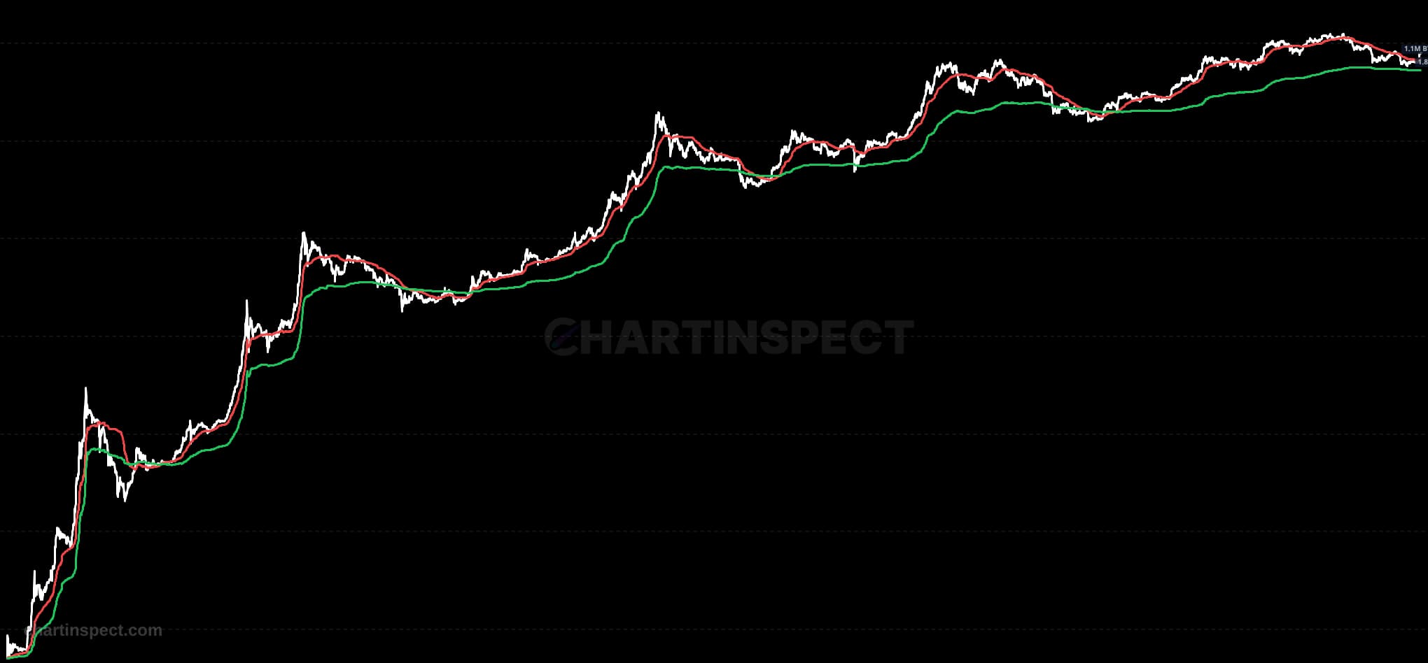
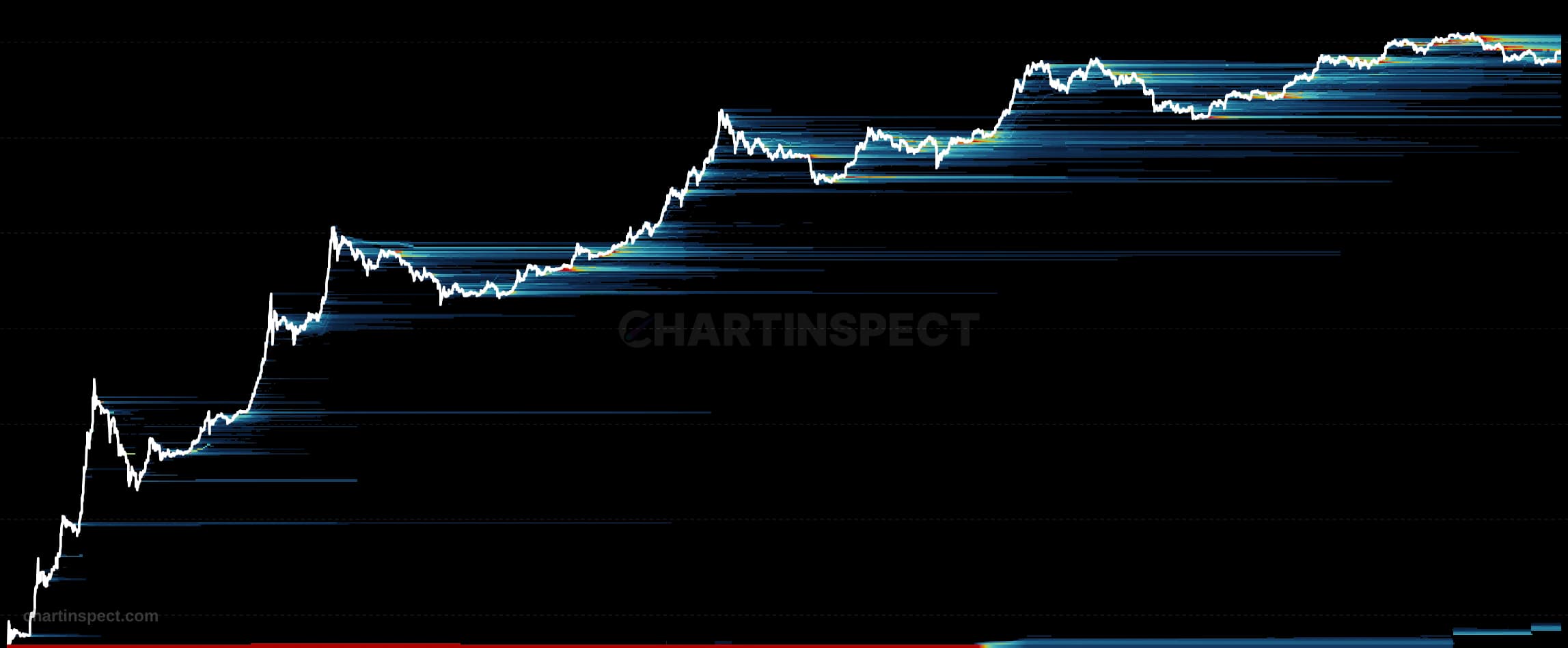
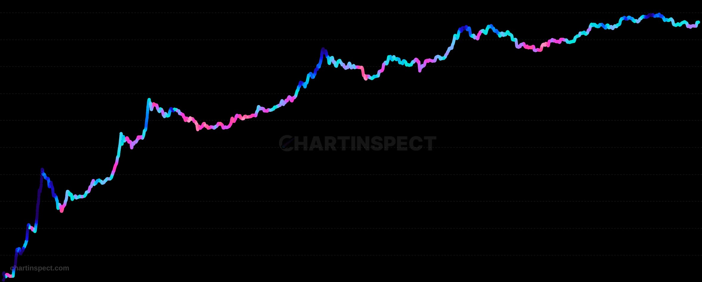
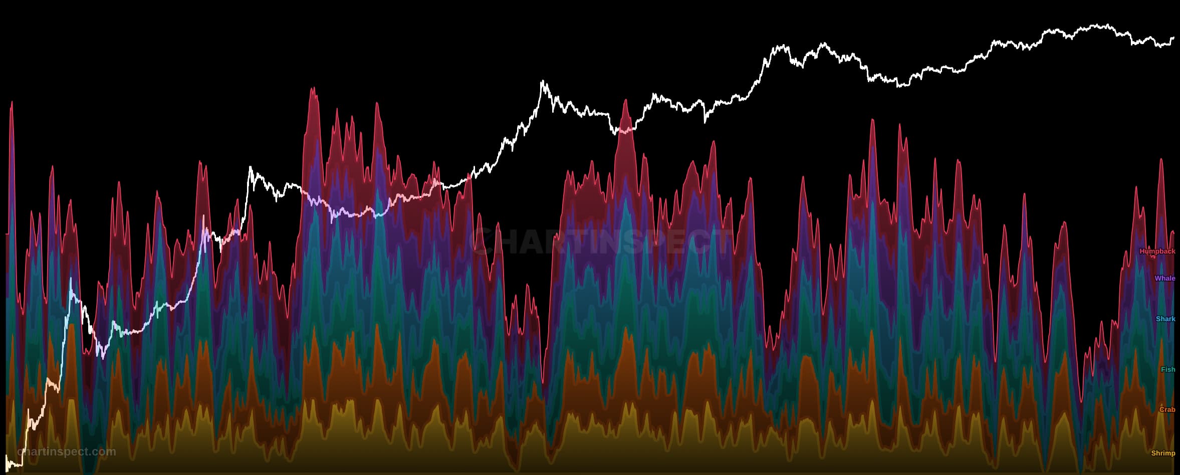
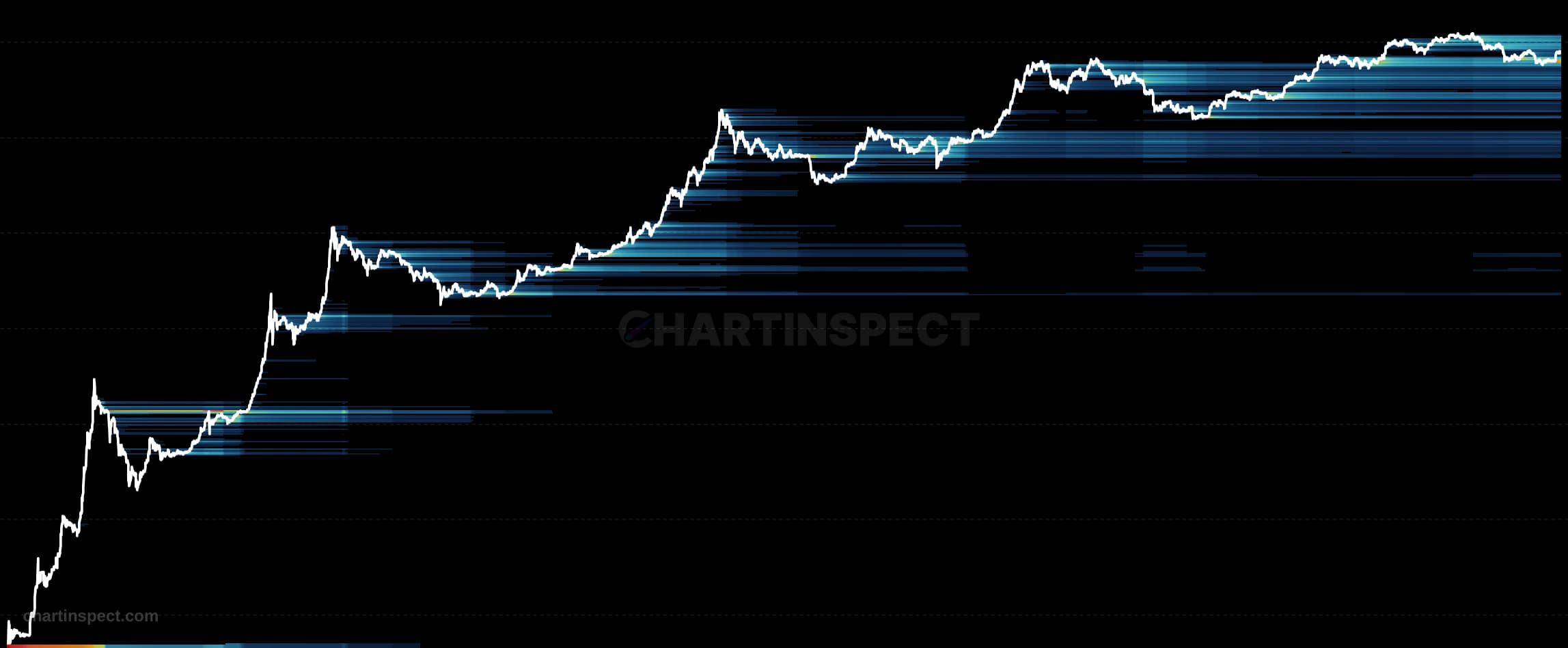
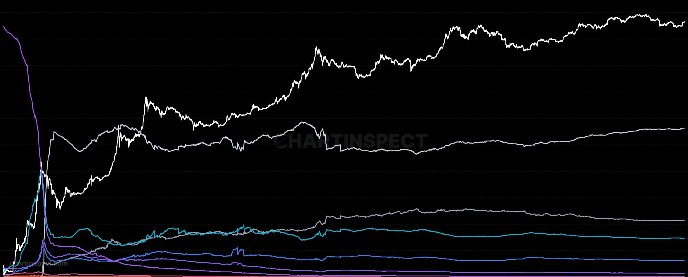
Bitcoin Cost Basis Quantiles plot the price levels at which different percentages of the total supply acquired their coins, drawn as a set of percentile lines (P5 through P95) overlaid directly on the Bitcoin price. Each line answers a simple question: below this price sits the cost basis of that share of the market. The P50 line is the median holder's break-even, the P5-P25 lines mark the cheapest-acquired long-term supply, and the P75-P95 lines mark the most recent and highest-priced buyers. Together they turn the entire cost-basis distribution into a readable map of where the market's coins were bought.
The spacing between the lines is the signal. Where the percentile lines cluster tightly, a large amount of supply shares a similar cost basis, forming a dense shelf that tends to act as strong support on the way down and stubborn resistance on the way up. Where the lines fan apart, cost basis is thinly spread and price moves through those zones more easily. When the Bitcoin price trades above the upper percentiles, nearly the whole market is in profit; when it slips below the median, more than half of all supply is underwater, a condition that has historically coincided with capitulation and accumulation zones.
Use Cost Basis Quantiles to locate the price bands that matter most to real holders rather than to arbitrary technical levels. Reclaiming a dense cluster from below signals that a large cohort has returned to profit, while losing one from above warns that a broad slice of the market has just gone underwater.
Check the selected asset, units, and cohort before comparing readings. Compare the metric over consistent dates and use related measures to understand what contributes to a change.