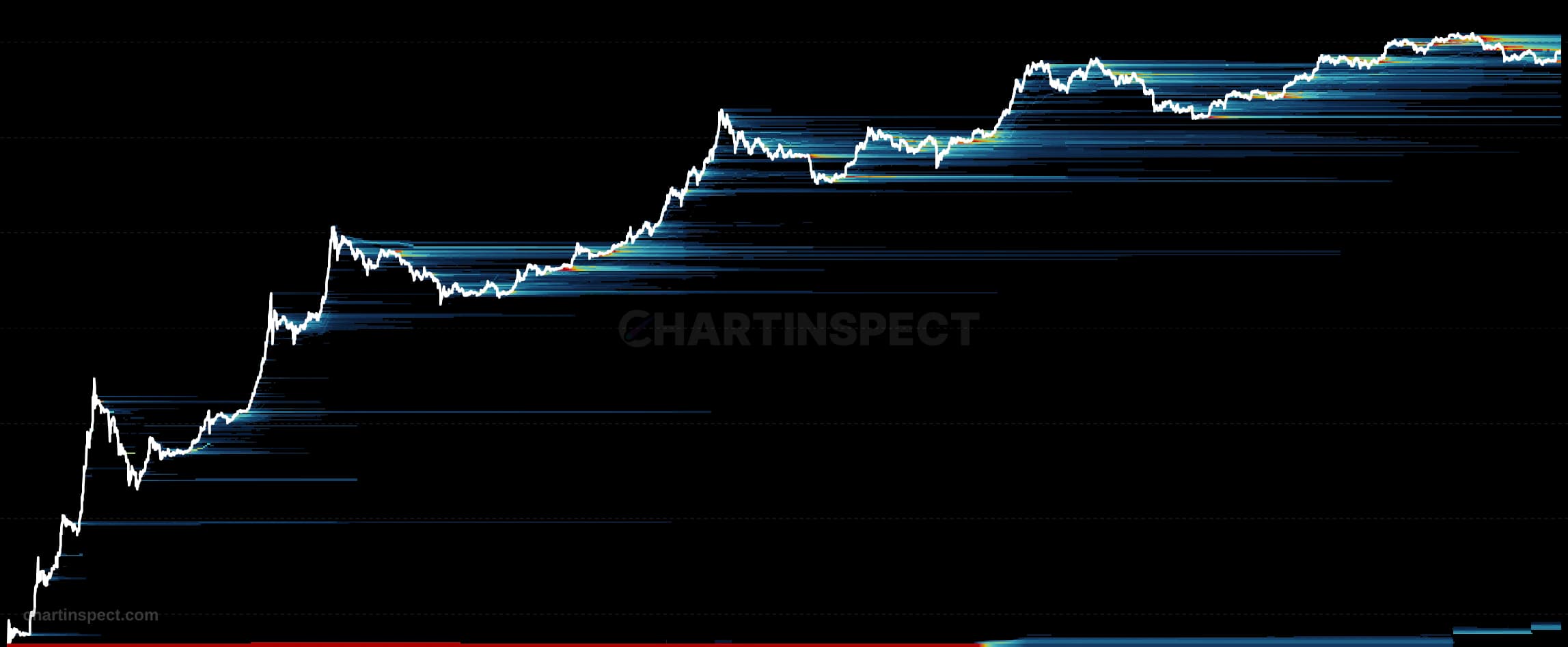
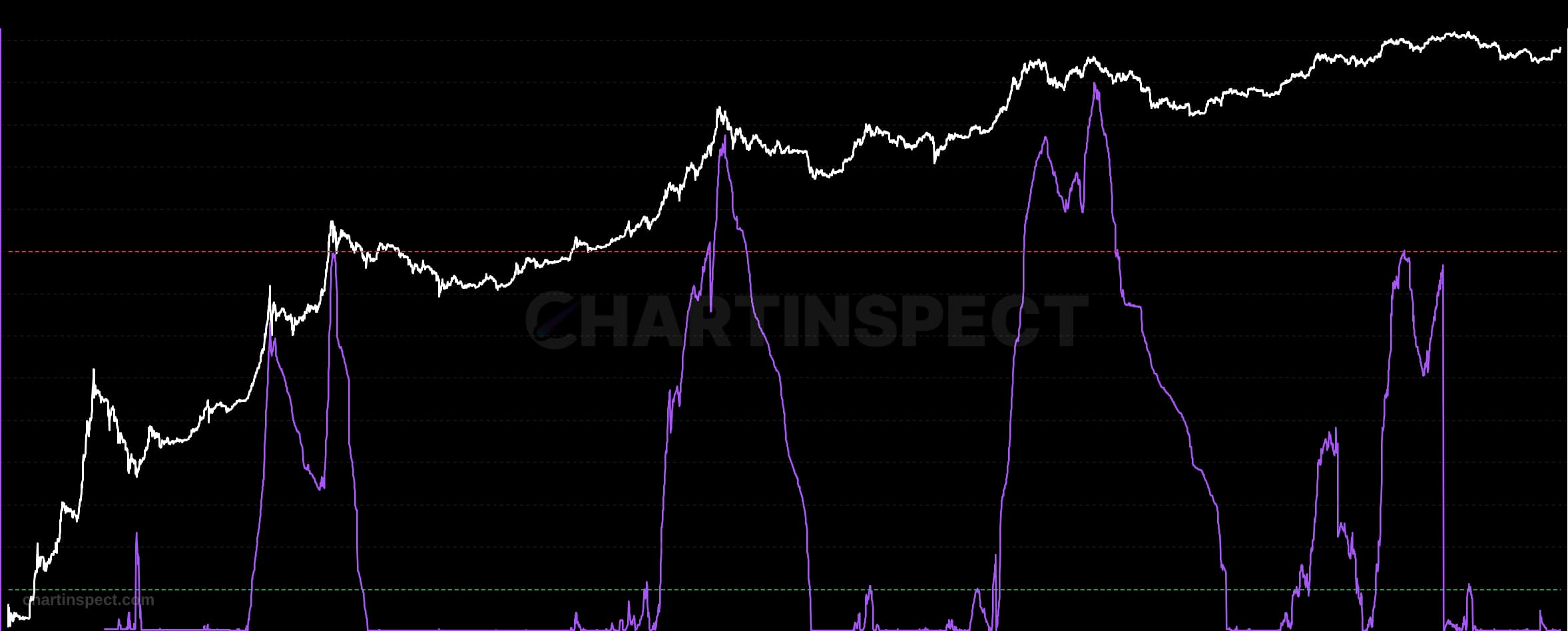
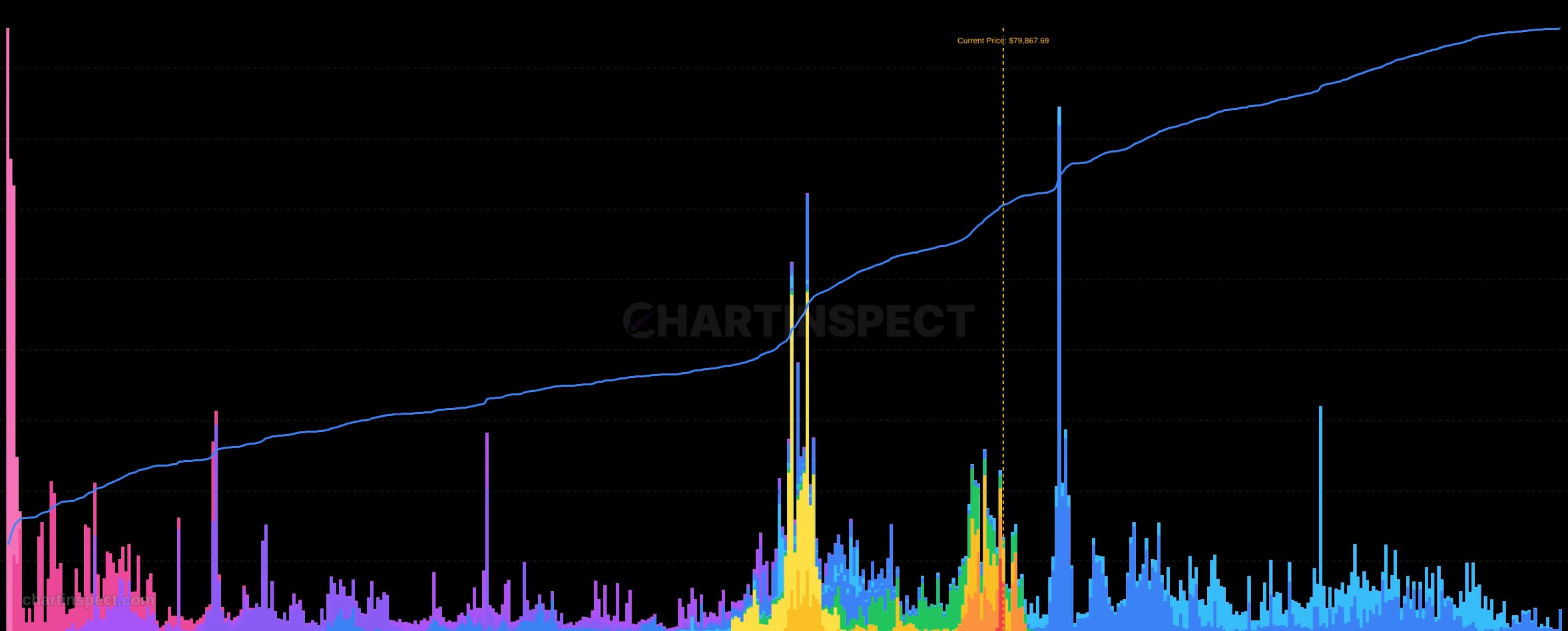
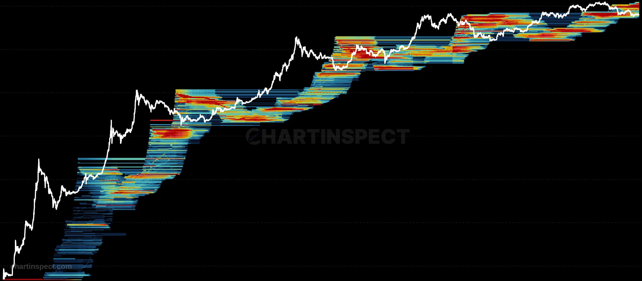
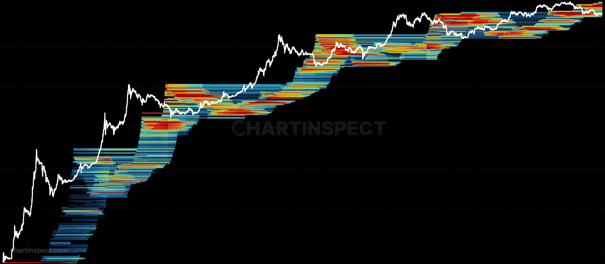
The Cohort Cost-Basis Profile pairs Bitcoin's price history with a supply profile drawn down the right-hand side of the same price axis. Every horizontal bar answers one question at that price level: how many coins last changed hands there, and who is holding them now. The bars are split into short-term holders, coins that moved within roughly the last five months, and long-term holders, coins that have sat still for longer. Reading across from any price on the left panel tells you how much supply is anchored at that level; reading down the profile shows where the market's cost basis is concentrated and where it is thin.
Concentrations matter because a price level where a large volume of coins was acquired tends to behave differently from one where almost nothing changed hands. The heaviest cluster around spot acts like a floor: those holders are close to break-even, and the long-term half of that supply has historically been slow to move. Short-term holder supply is the more reactive half, and when it sits underwater it is typically the first to sell into a recovery. Above spot, the first large long-term holder cluster marks the level where patient supply becomes available again, which is why it often caps the next leg up. The chart detects and labels both of these bands directly from the data rather than annotating them by hand.
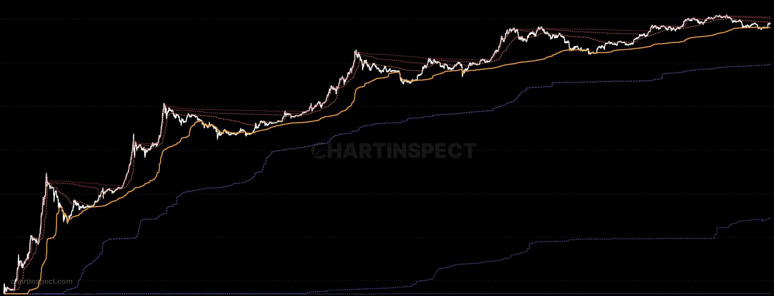
Use it alongside the Short-Term Holder Cost Basis line, which is plotted on the left panel in red. When price trades above that line the average recent buyer is in profit and the market is structurally healthier; when price falls below it, recent buyers are underwater and the shelf beneath spot becomes the level that has to hold. The Realized Price line in green is the aggregate cost basis of the entire supply and moves far more slowly, giving a longer-term reference for whether the market as a whole is in profit. Because the profile is a snapshot of where cost basis sits today rather than a time series, it is best read as a map of supply structure rather than as a signal on its own.
Check the selected asset, units, and cohort before comparing readings. Compare the metric over consistent dates and use related measures to understand what contributes to a change.