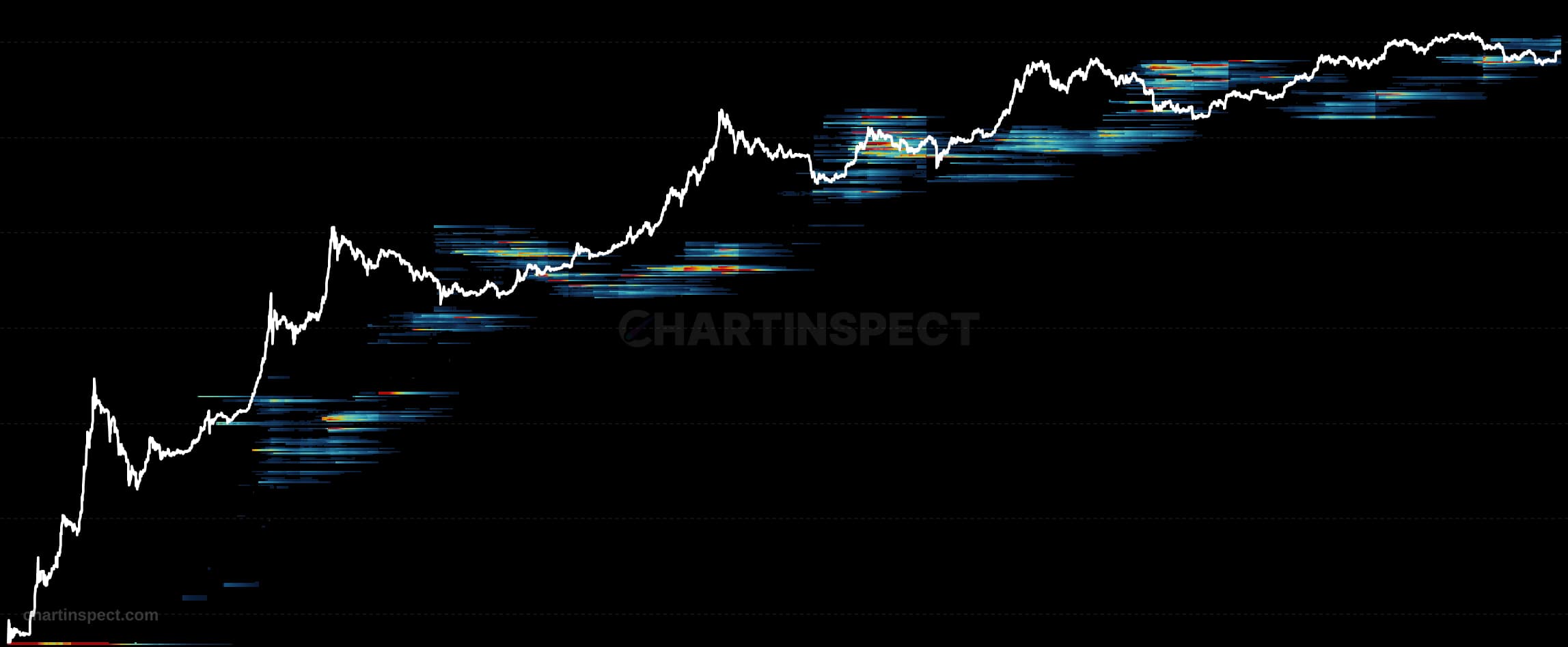
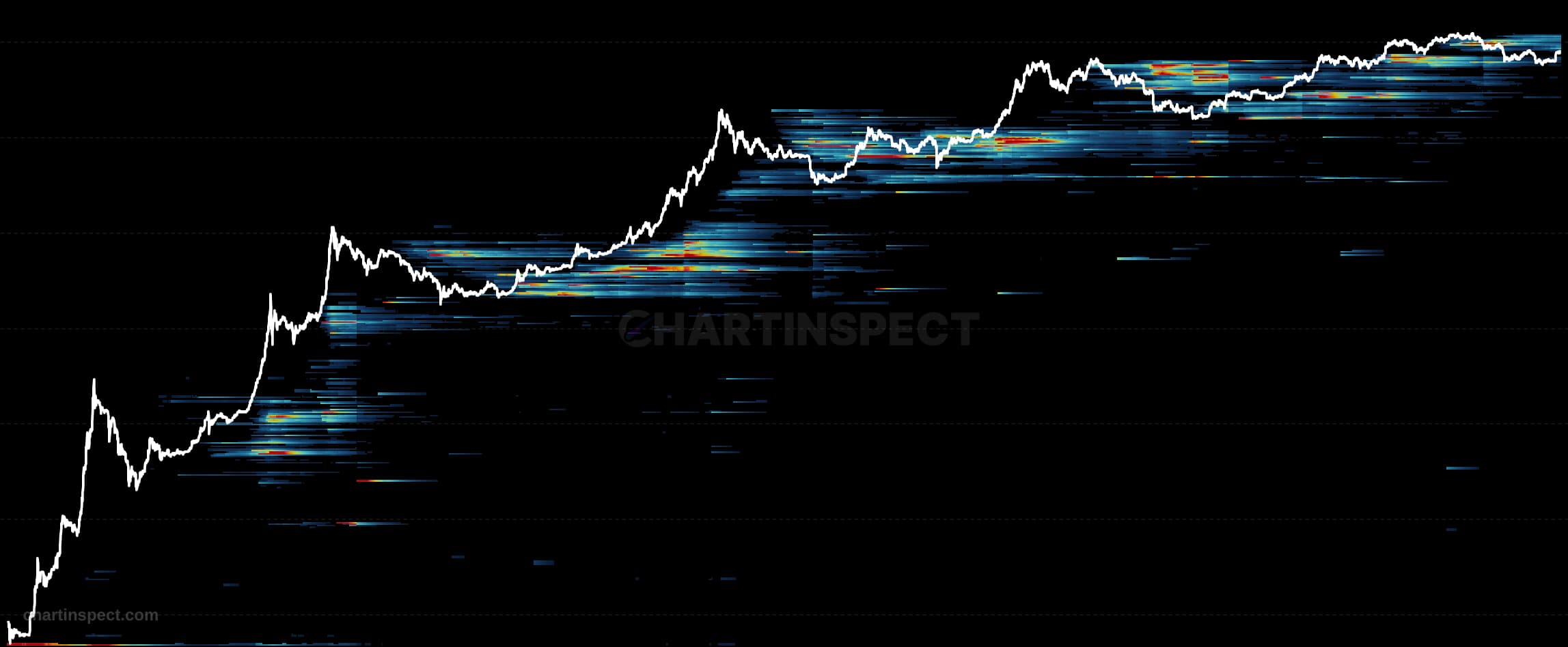
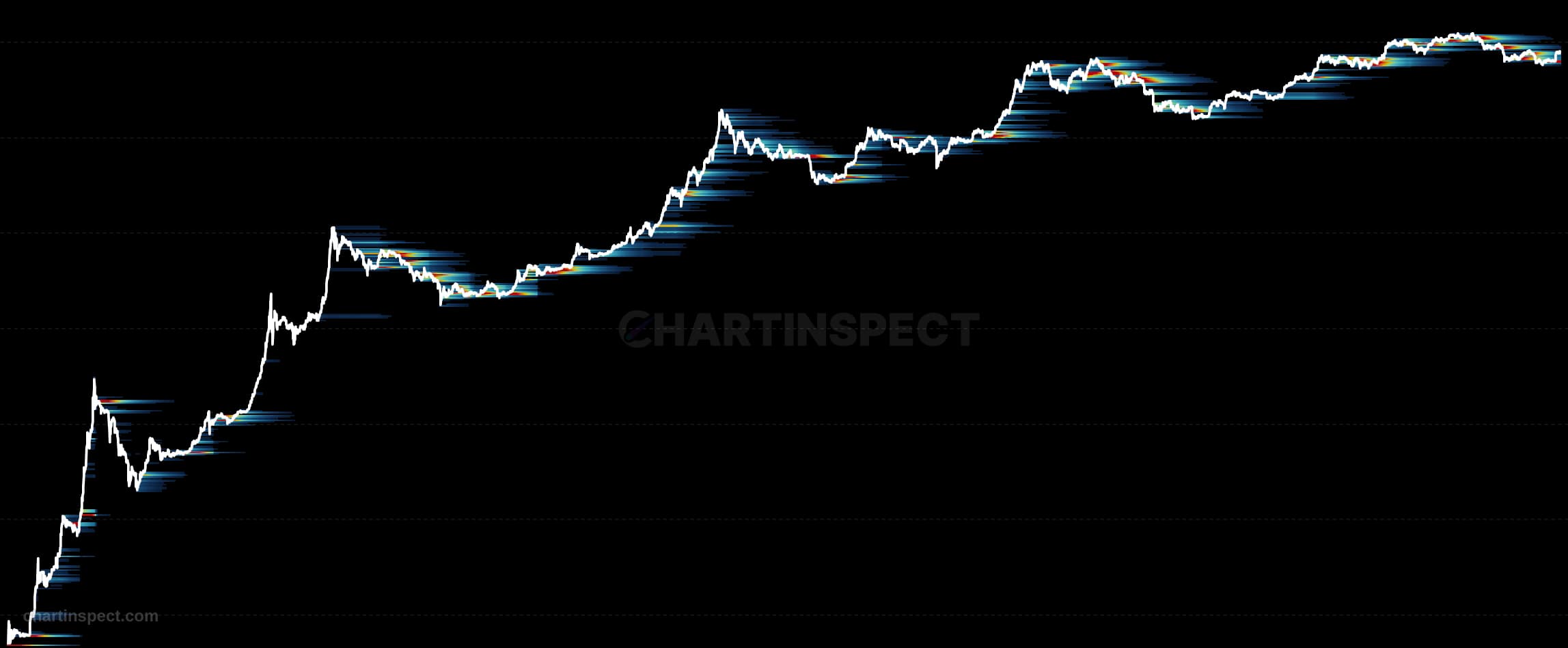
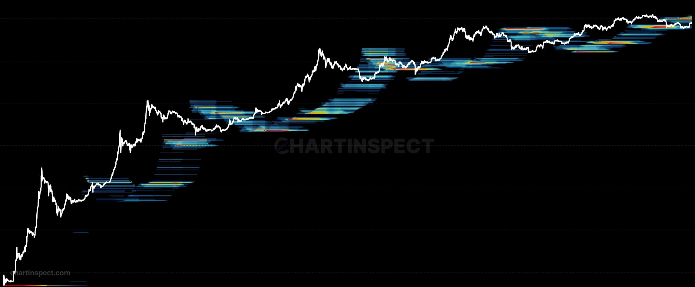
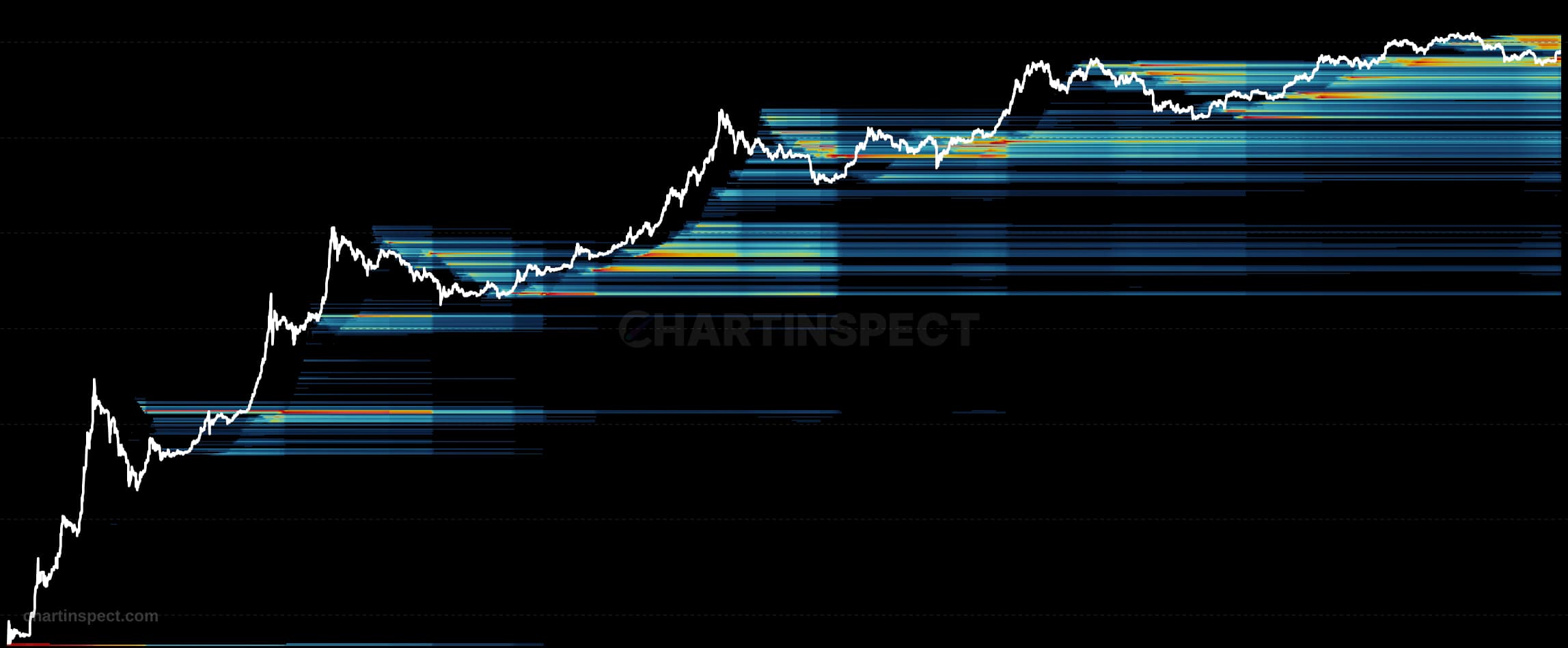
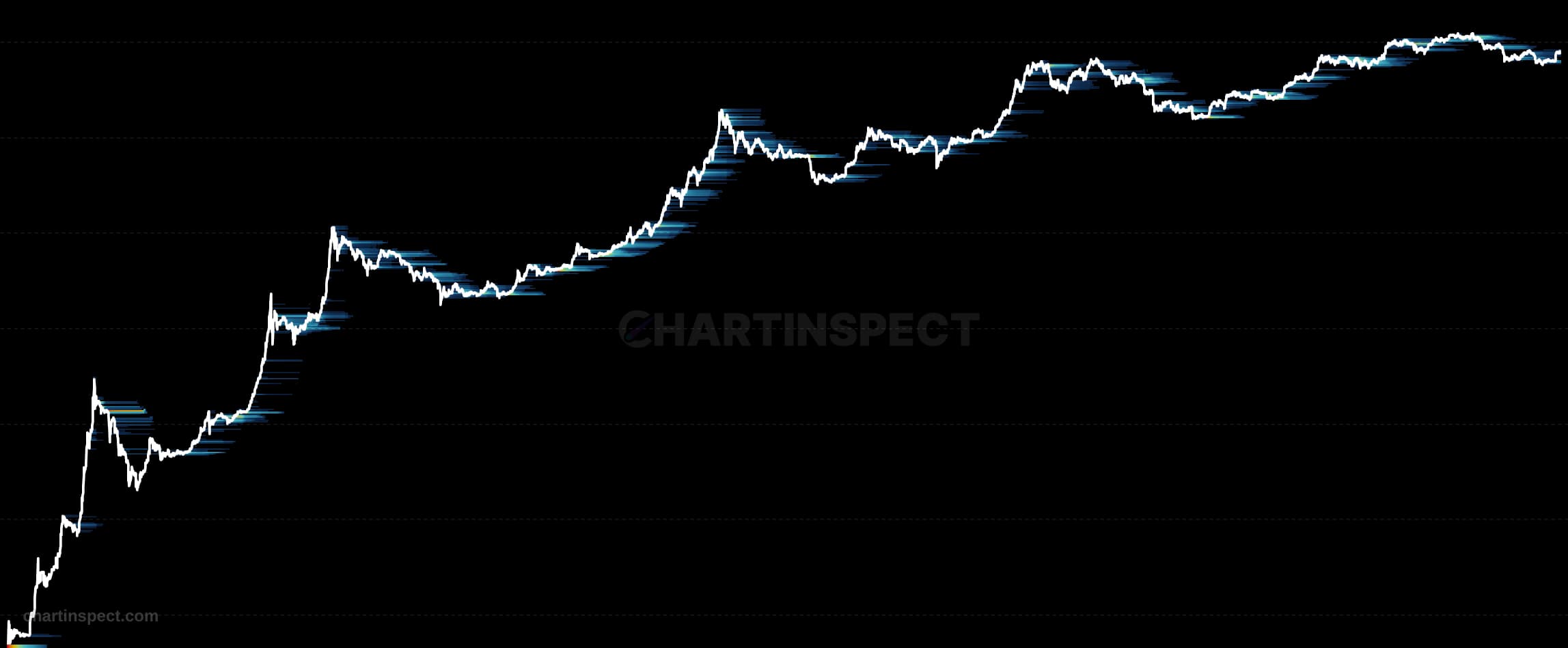
The Bitcoin SOPD Heatmap (Spent Output Price Distribution) maps every coin spent on a given day back to the price level at which it was originally acquired on-chain, then distributes those spent volumes across a price axis over time. It is the spending-side companion to URPD: where URPD shows the acquisition prices of coins still being held, SOPD isolates only the coins that actually moved, revealing the original cost basis of Bitcoin's active sellers rather than its passive holders.
Read the heatmap by locating where spending concentrates along the price axis relative to the current market price. Spikes clustered at recent prices indicate that today's sellers bought in near the top, a signature of panic selling by newer buyers exiting close to their entry. Spikes at much older, lower prices instead show long-term holders distributing coins acquired far earlier in the cycle. The intensity at each level reflects how much spent volume shares that origin price.
Use SOPD to characterize the composition of selling pressure rather than its magnitude alone. Concentrated spending at recent prices suggests capitulation among weak hands and short-term stress, while heavy distribution from old, deeply-in-profit coins points to strategic profit-taking by experienced holders. Reading it alongside URPD lets you compare what is being sold against what remains held, sharpening your view of which Bitcoin cohorts are driving a given move.
Check the selected asset, units, and cohort before comparing readings. Compare the metric over consistent dates and use related measures to understand what contributes to a change.