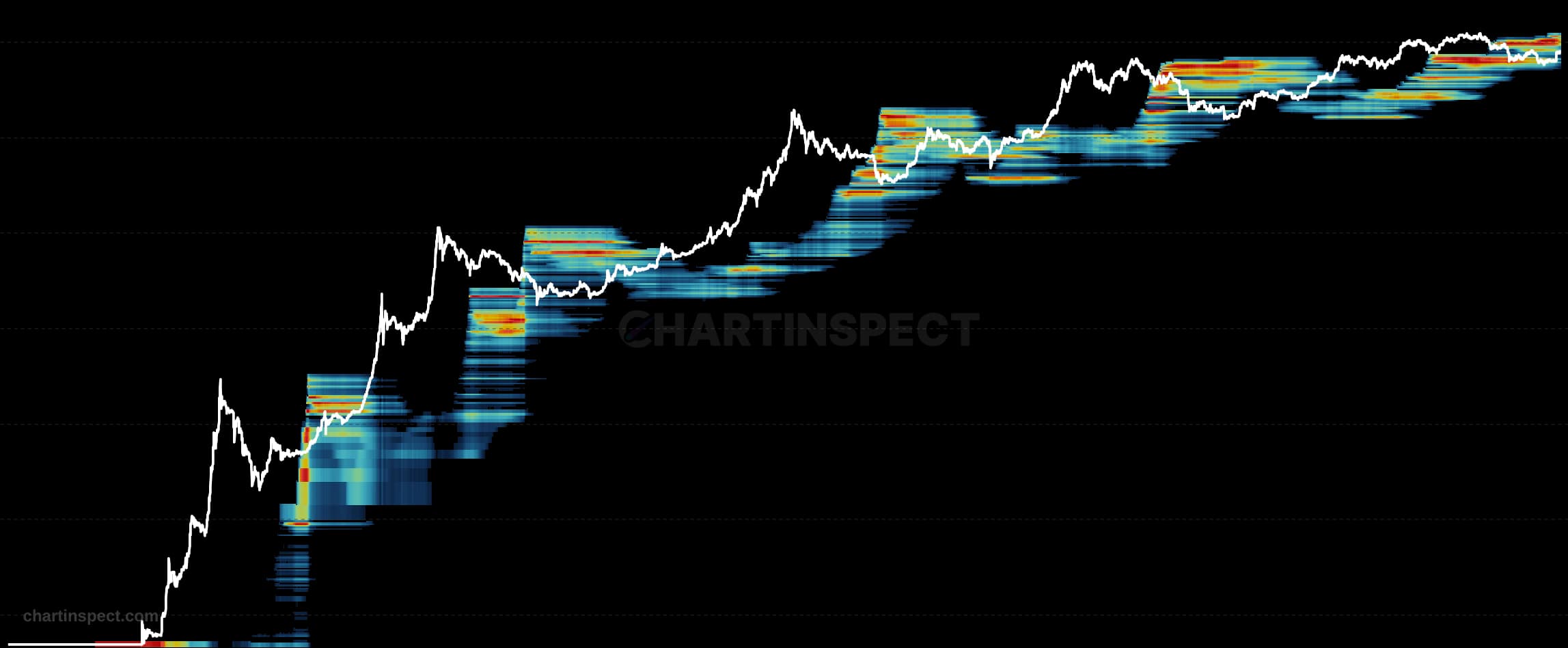
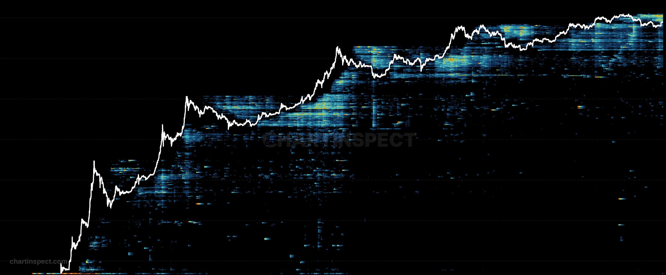
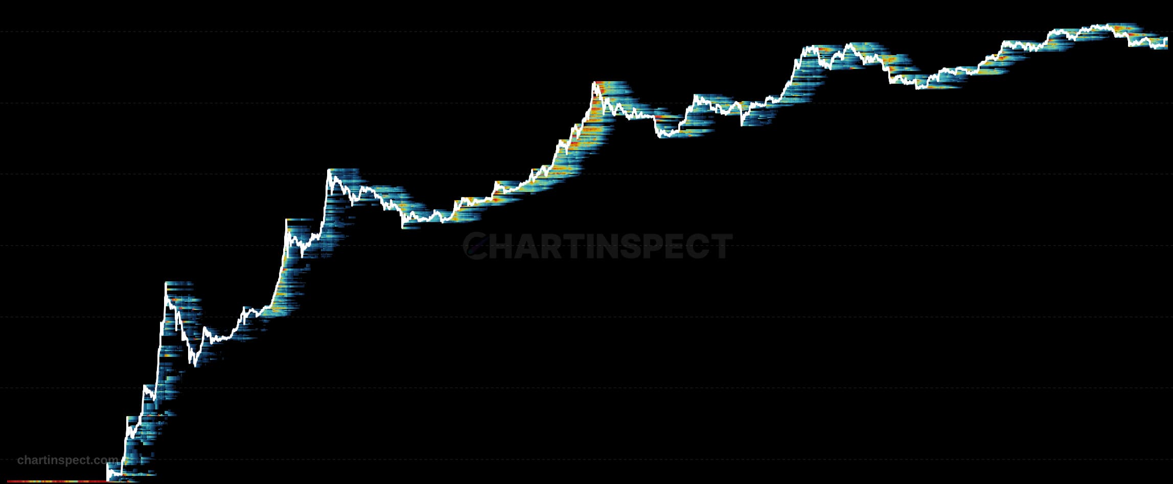
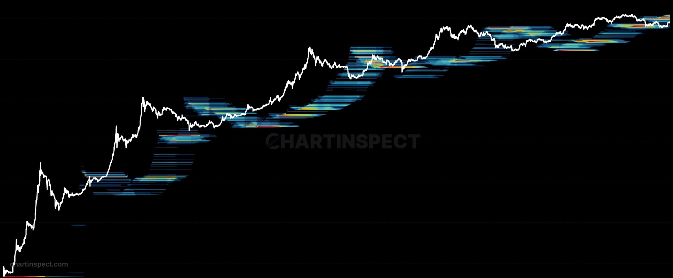
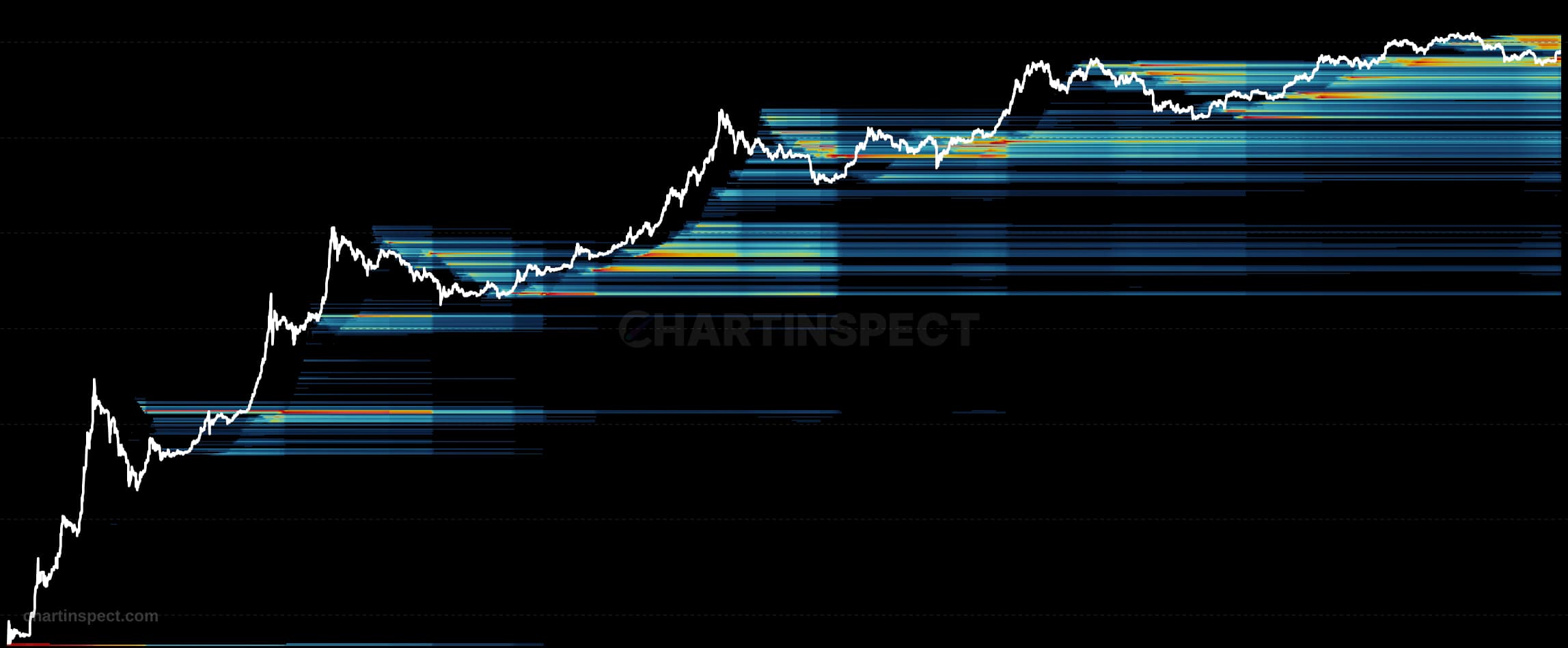
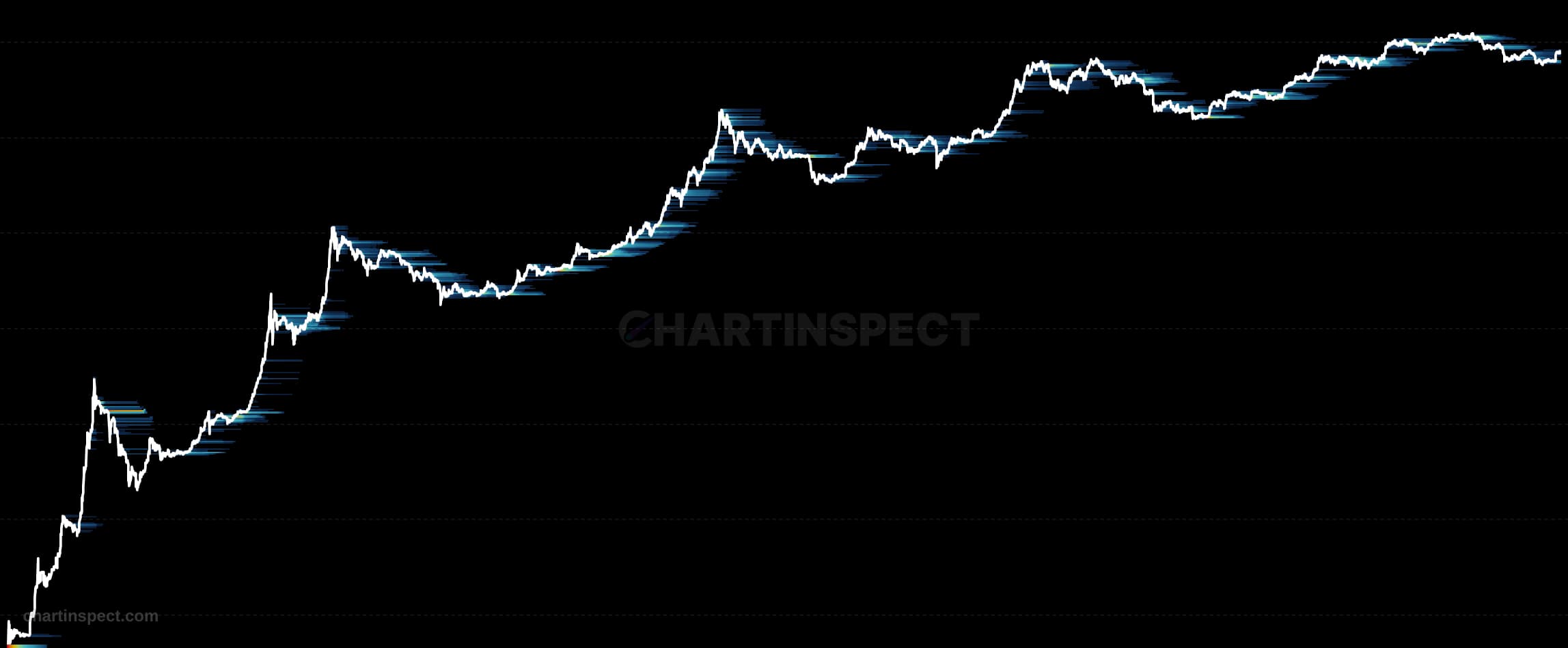
The Bitcoin Realized P/L Heatmap maps where selling pressure originates by plotting the dollar value of realized profit or loss at each original cost basis level, day by day. The Y-axis marks where sellers originally acquired their Bitcoin, the X-axis marks when they sold, and the brightness of each cell encodes the volume of profit or loss realized at that intersection. Rather than collapsing spending into a single number, it decomposes daily realized P&L across the full range of holder cost bases, exposing exactly which price cohorts are moving coins.
Read the heatmap by scanning vertically for bright bands: a glowing row far below the current price marks long-term holders realizing large profits, while a bright row near or above spot marks recent buyers realizing losses or capitulating. Persistent brightness at a given cost basis level identifies a cohort that is actively distributing, and shifting bands over time trace how selling pressure migrates between holder groups. Because raw daily values are noisy, the chart is best viewed with smoothing applied, using a 14 to 30 day EMA to make the dominant distribution structure legible.
Use the heatmap to distinguish healthy profit-taking from stress-driven selling: bright profit rows deep below price suggest orderly distribution, whereas bright loss rows clustered near recent cost bases signal capitulation among newer Bitcoin holders.
Check the selected asset, units, and cohort before comparing readings. Compare the metric over consistent dates and use related measures to understand what contributes to a change.