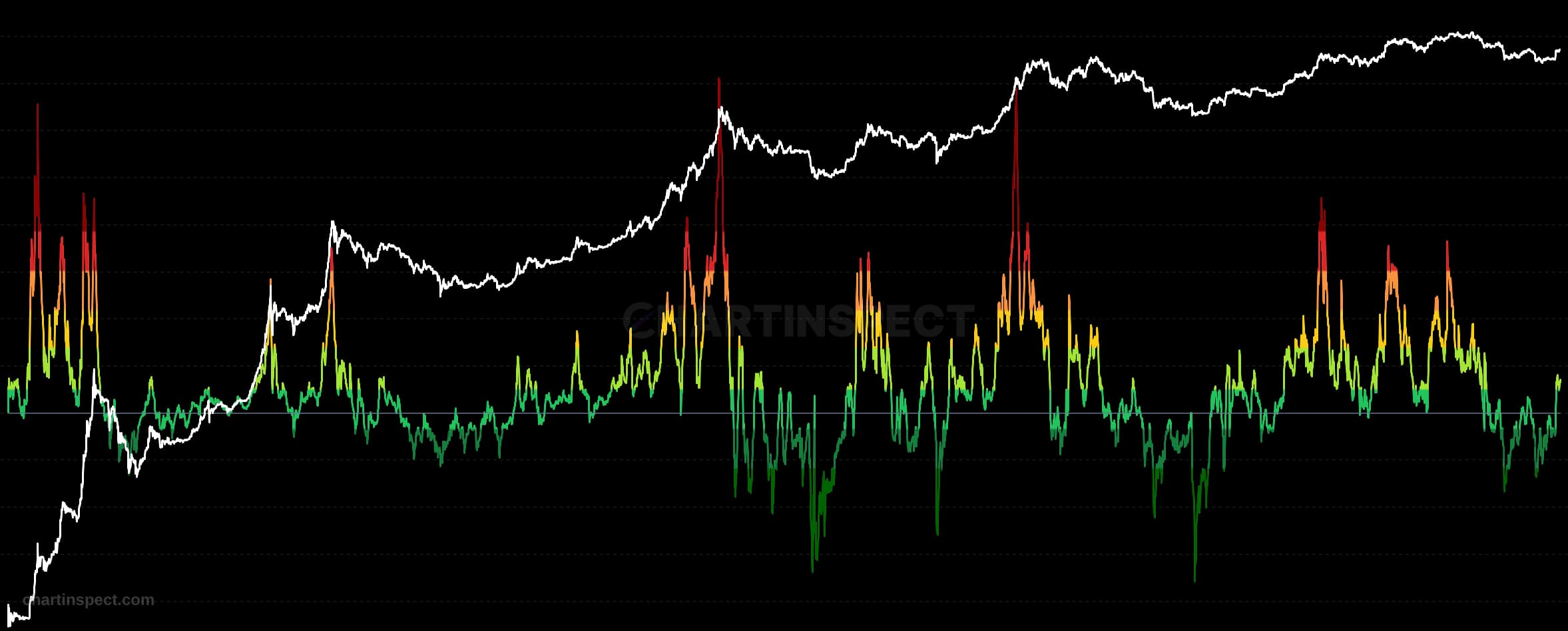
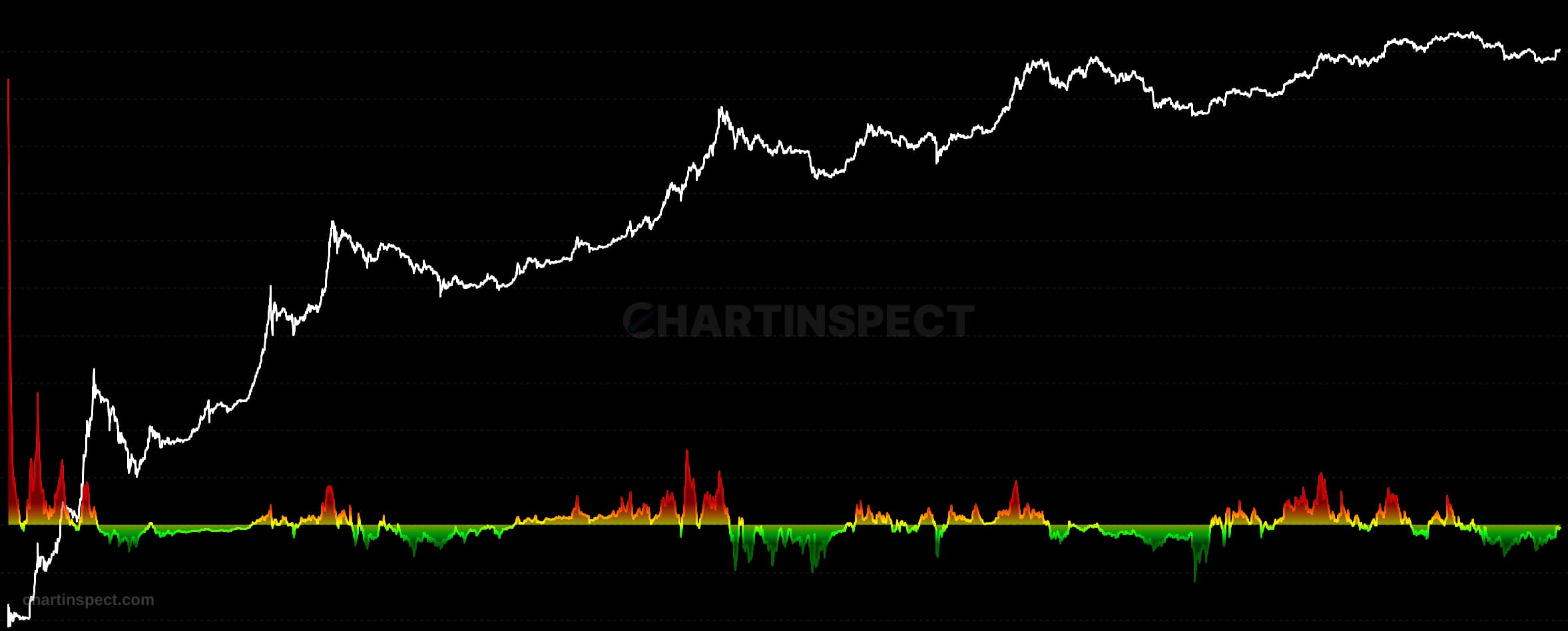
Every time a coin moves on-chain, it carries a cost basis: the price at which that specific output was created. Its profit ratio is simply the price it was spent at divided by the price it was created at. Above 1 means it moved at a profit, below 1 at a loss.
Standard SOPR aggregates those spends as a ratio of sums: total USD value spent divided by total USD value at creation. That makes it value-weighted, so a single whale moving a large old coin can swing the entire day's reading, and the metric tells you what the money did rather than what the typical holder did.
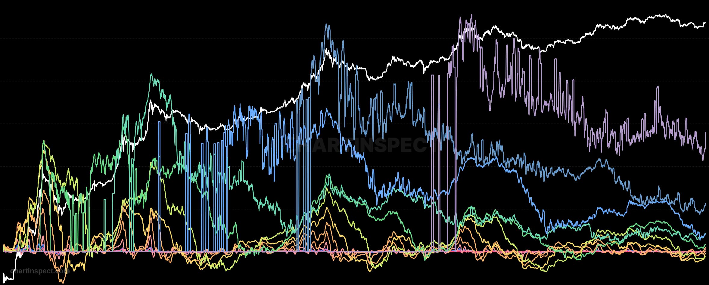
Median SOPR takes the other route. We keep the profit ratio of every individual spent output, sort them, and read off the true middle value: the exact 50th percentile, not an approximation or a bucketed estimate. Because a median ignores the size of each spend, one enormous transaction counts exactly as much as one tiny one, and the result describes the behaviour of the typical coin movement instead of the largest ones. The 25th and 75th percentile lines are computed the same way and show how wide the distribution is: when the 75th percentile runs far above the median, a meaningful minority of coins are realizing outsized profits even while the typical spend is near break-even, which is a classic late-cycle distribution signature.
Spends younger than 24 hours are excluded. Most of those are change outputs, coins that return to the sender in the same transaction rather than representing a real economic decision, and on daily-priced chains they are created and spent against the same daily close, which pins their ratio to exactly 1.0 and would otherwise flood the distribution with meaningless values. This is the same reasoning behind adjusted SOPR (aSOPR), which excludes very short-lived spends for the same reason.
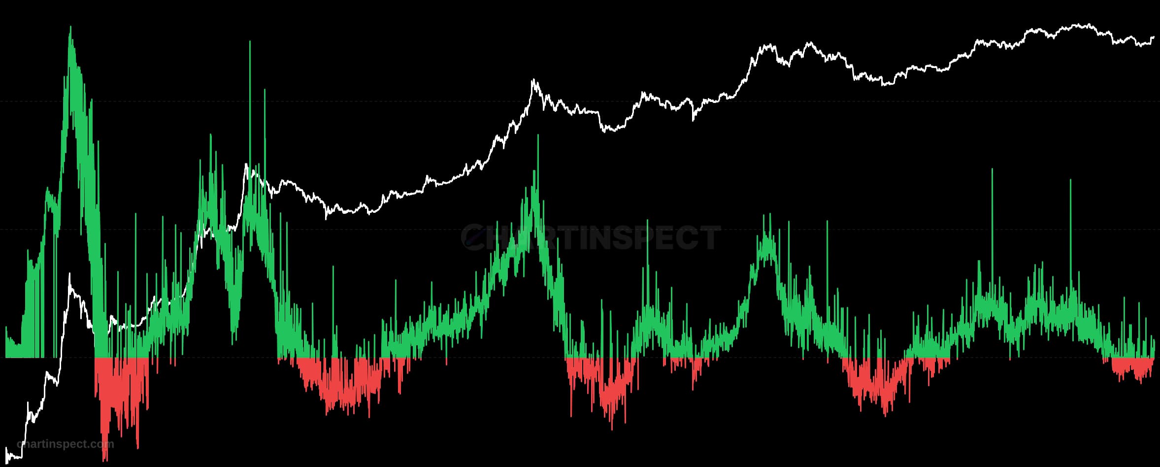
Read the median against 1.0, the break-even line. Sustained readings above 1 mean the typical coin in motion is being sold at a profit, which is what distribution looks like; sustained readings below 1 mean holders are capitulating and moving coins at a loss, which historically clusters around bottoms. The percentile band is often the more actionable half of the chart: a spike in the 75th percentile while the median stays flat is a sign that old, deeply profitable coins are waking up.
Check the selected asset, units, and cohort before comparing readings. Compare the metric over consistent dates and use related measures to understand what contributes to a change.