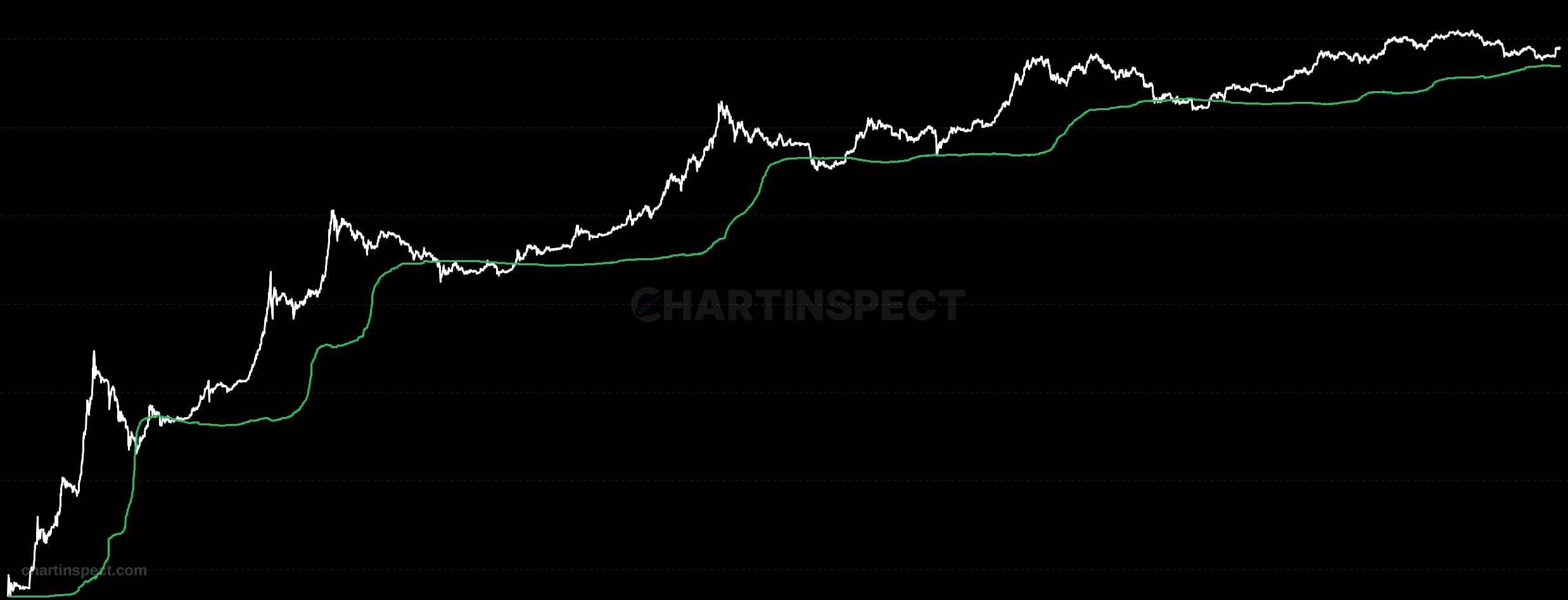
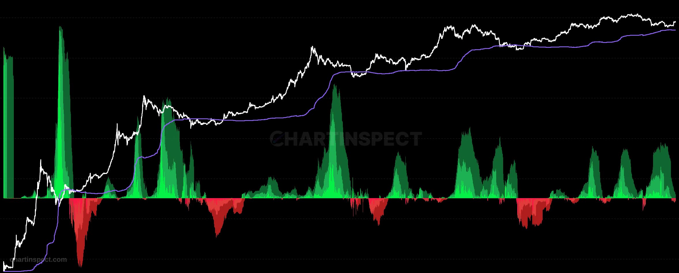
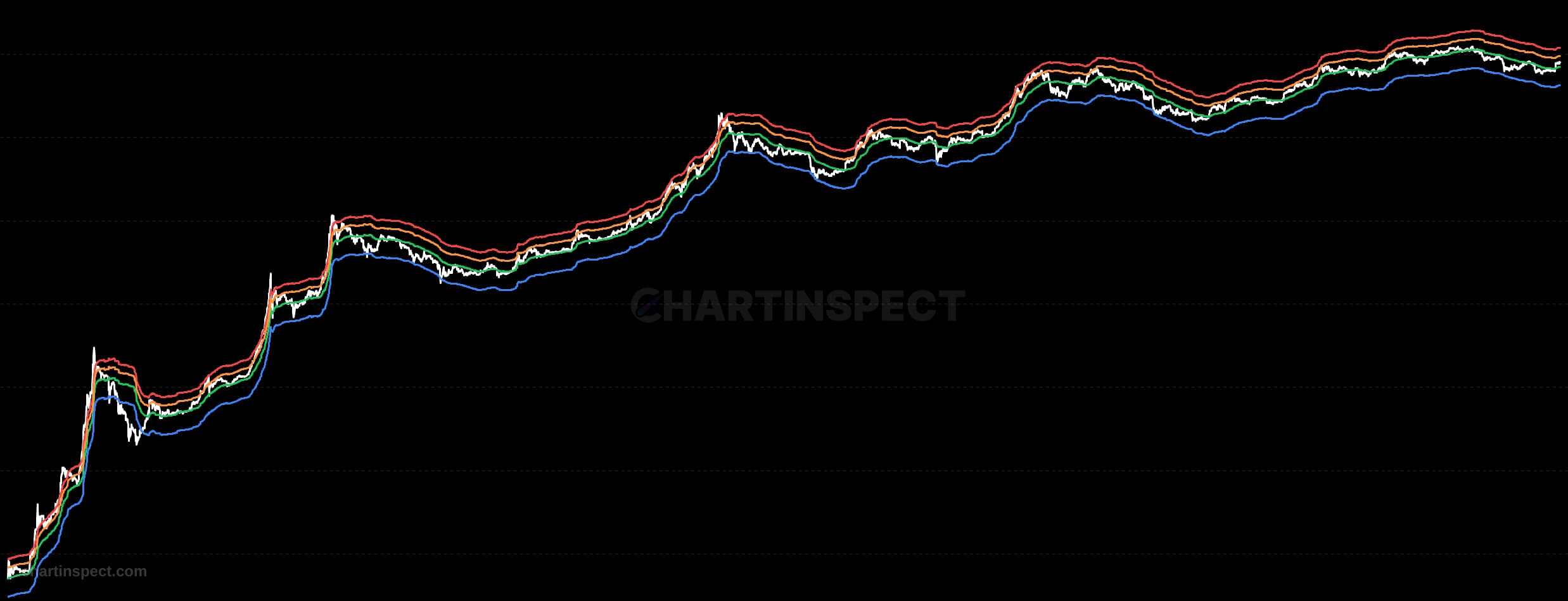
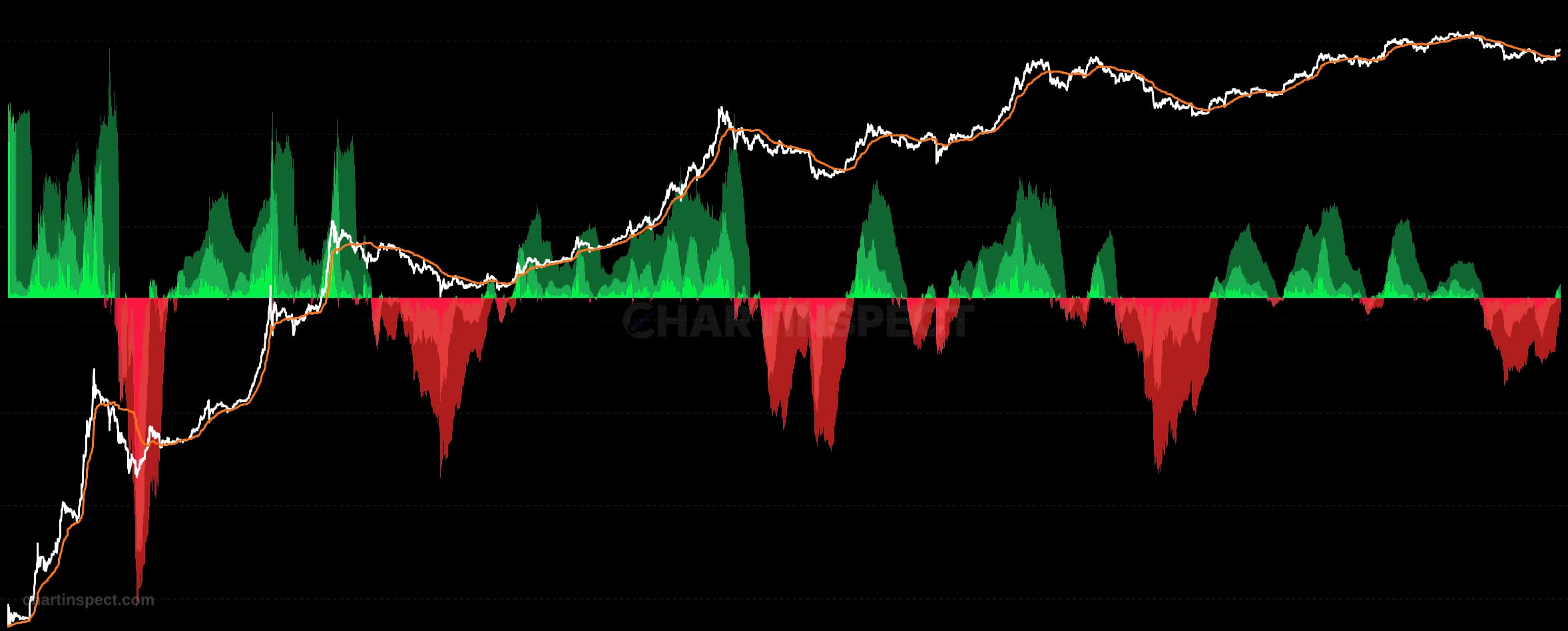
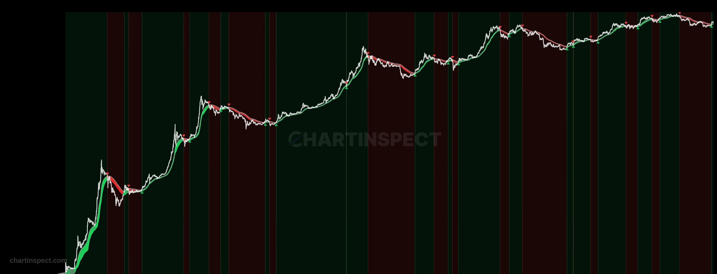
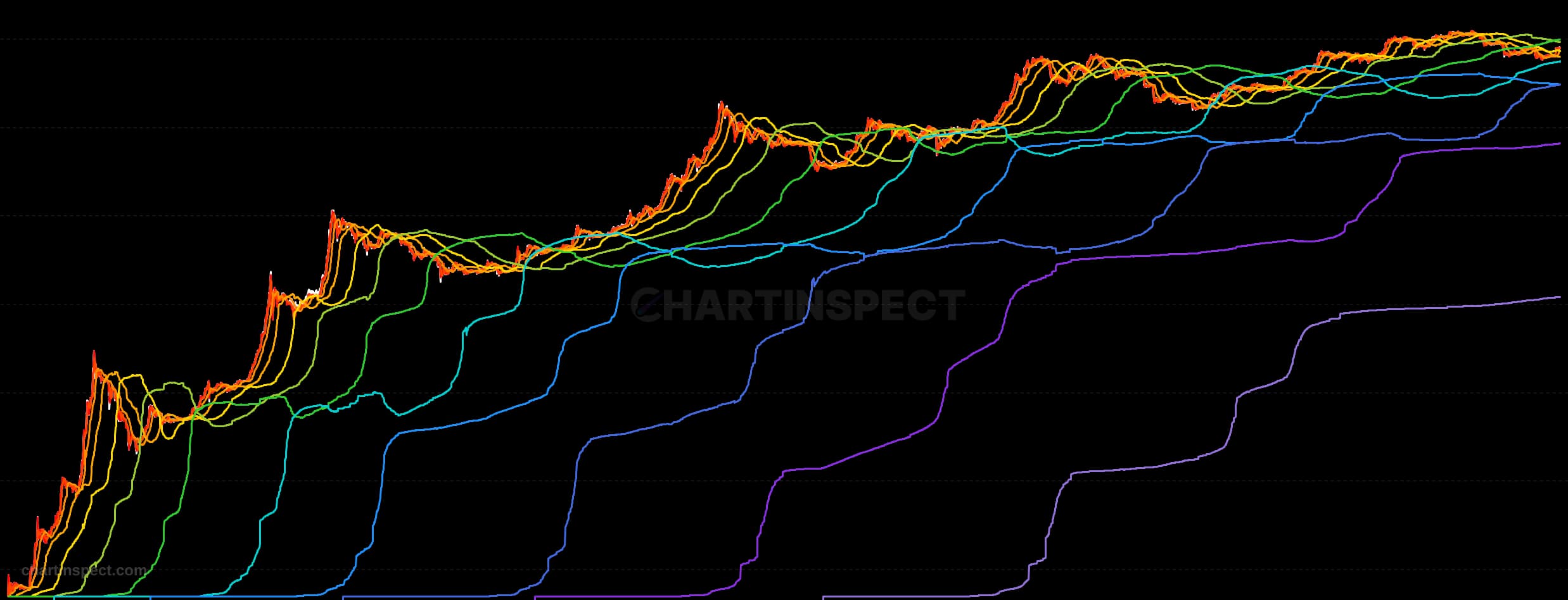
Every coin in circulation has a cost basis: the price at which it last moved. Collect all of them and you get a distribution, and this chart plots that distribution over time.
Each of the 19 lines is a quantile of the supply, taken every 5 percentage points from the 5th to the 95th. The 50th line is the median cost basis: half the circulating supply was acquired below it and half above. The 95th line is the price below which 95% of the supply was acquired, and the 5th is the level below which only the cheapest 5% sits. The coloured bands between the lines therefore each hold exactly 5% of the supply, and their width tells you how concentrated the market's cost basis is: narrow bands mean a lot of coins changed hands in a tight price range, while a band that stretches across thousands of dollars means that slice of the supply is spread thinly.
The price line is overlaid on top, and reading it against the bands is the point of the chart. When spot is above the 95th percentile line, more than 95% of the supply is in profit, which is the condition that has historically marked euphoric tops. When spot falls into the lower bands, the majority of the market is underwater, which is what capitulation looks like. Watching which band price is currently sitting in, and which bands it has recently cut through, gives you the same information as supply-in-profit but with the whole distribution visible rather than collapsed to a single number.
The quantiles are exact order statistics read from the live cost basis distribution, not estimates. We track cost basis on a tiered-linear grid with dollar-level resolution rather than the coarse log-spaced buckets that are common in this kind of chart, so each quantile is precise to about a dollar at spot instead of carrying a percentage-wide error that would be broader than the bands themselves.
Check the selected asset, units, and cohort before comparing readings. Compare the metric over consistent dates and use related measures to understand what contributes to a change.