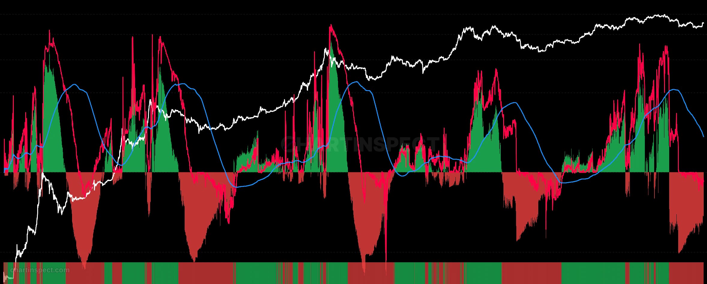
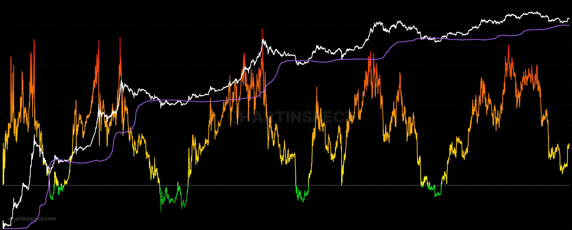
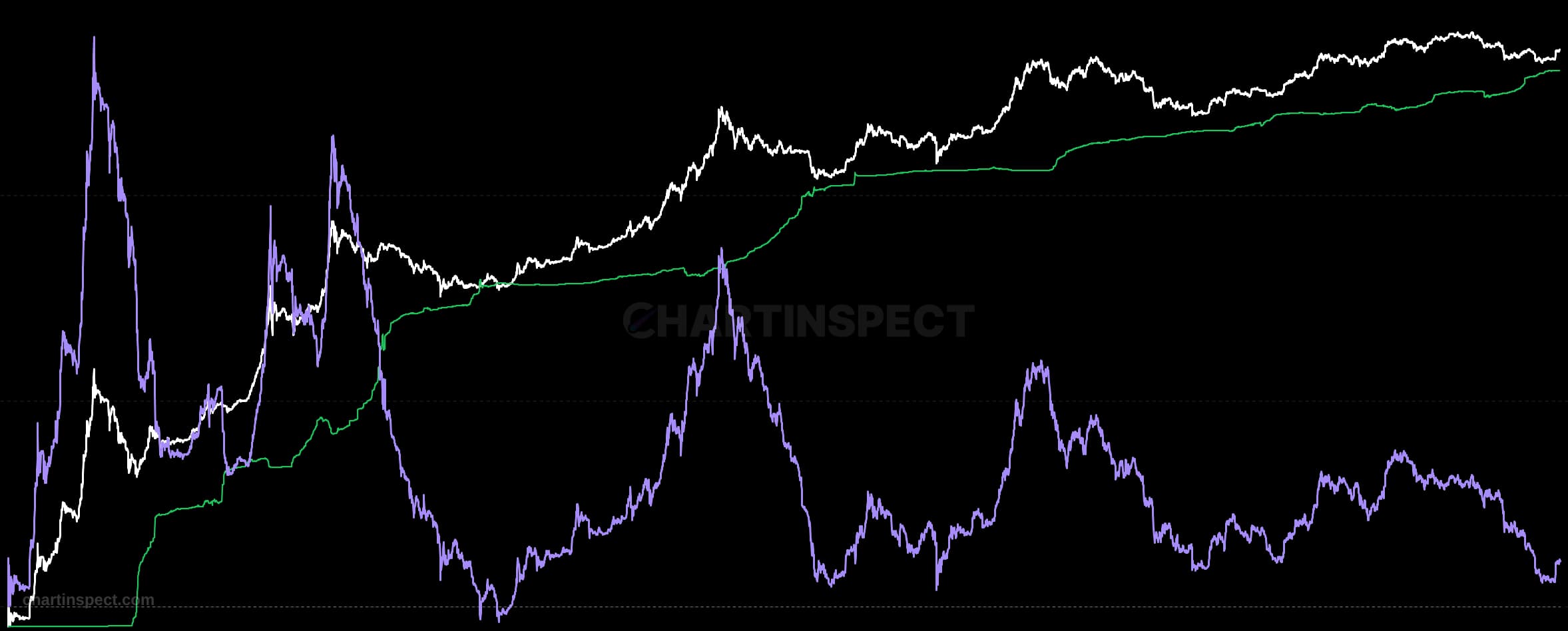
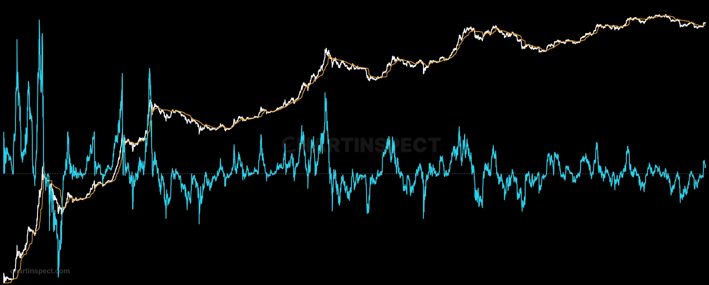
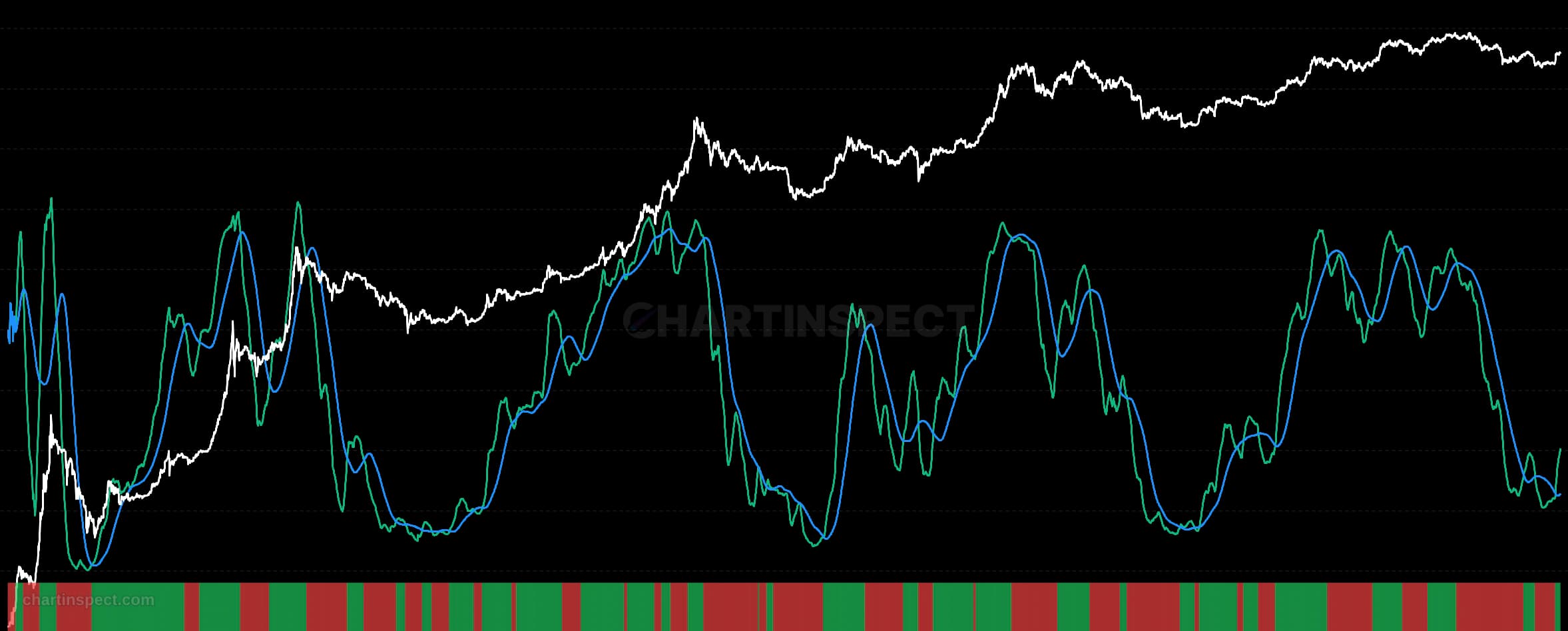
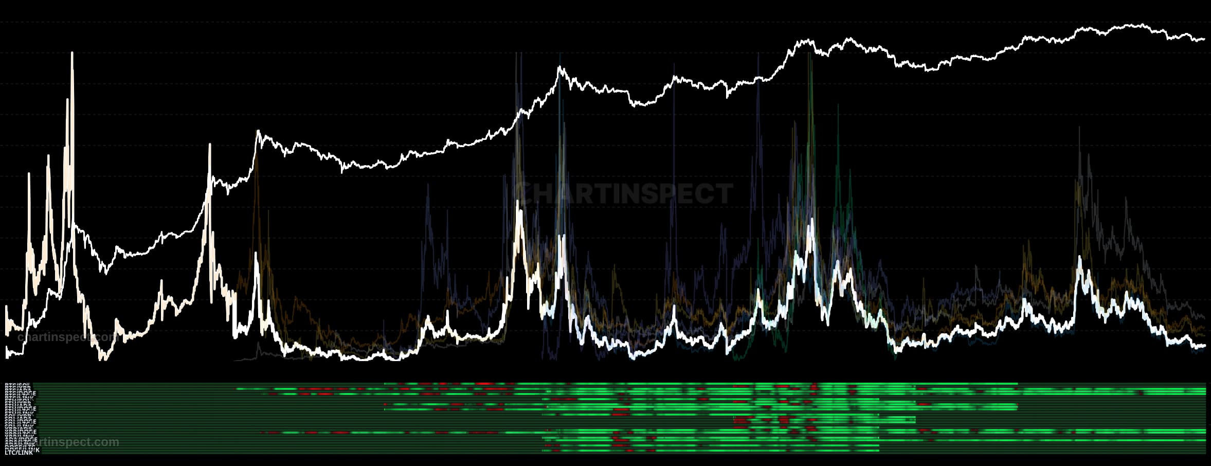
The Price vs MVRV Percentile Divergence chart measures the gap between an asset's price percentile and Bitcoin's MVRV percentile, each ranked over a trailing 365-day window. Rather than reading price or MVRV in isolation, it converts both into where they sit within the past year's range, then subtracts one percentile from the other. The result is a single divergence line that isolates when price and the underlying market-to-realized valuation are moving out of step.
Read the divergence as a spread centered on zero. When the line pushes toward the high end near +35, both the price percentile and the Bitcoin MVRV percentile are elevated together, signalling that the assets are expensive on both counts. When it falls toward the low end near -35, the percentile ranks are compressed, which the chart flags as a relative accumulation zone. Values between the extremes describe the degree to which valuation is confirming or diverging from raw price.
Use the extremes as context rather than precise triggers. A reading around +35 marks stretched, expensive conditions where price and Bitcoin MVRV are both rich within their 365-day range, while a reading near -35 highlights potential accumulation opportunity. Because every input is a rolling one-year percentile, the divergence adapts to each new market regime instead of anchoring to fixed historical prices.
Check the selected asset, units, and cohort before comparing readings. Compare the metric over consistent dates and use related measures to understand what contributes to a change.